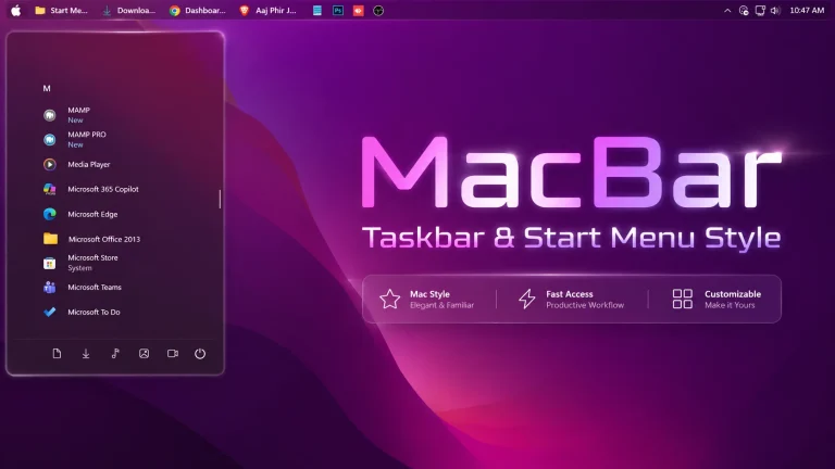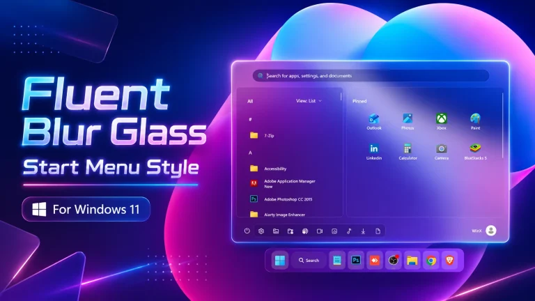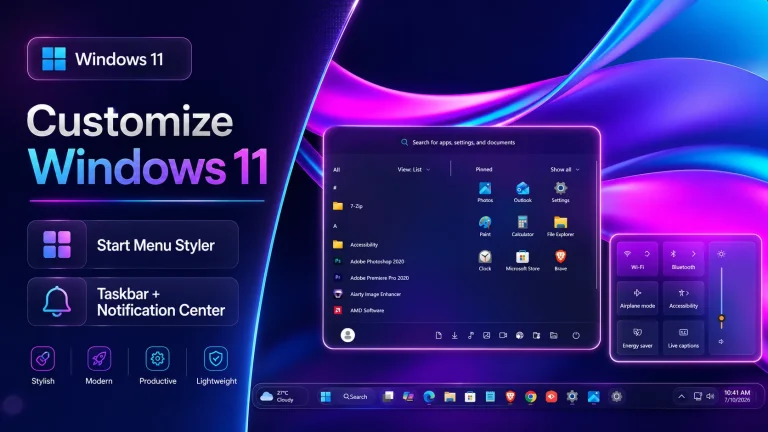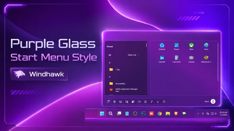
Glacier Start Menu Style
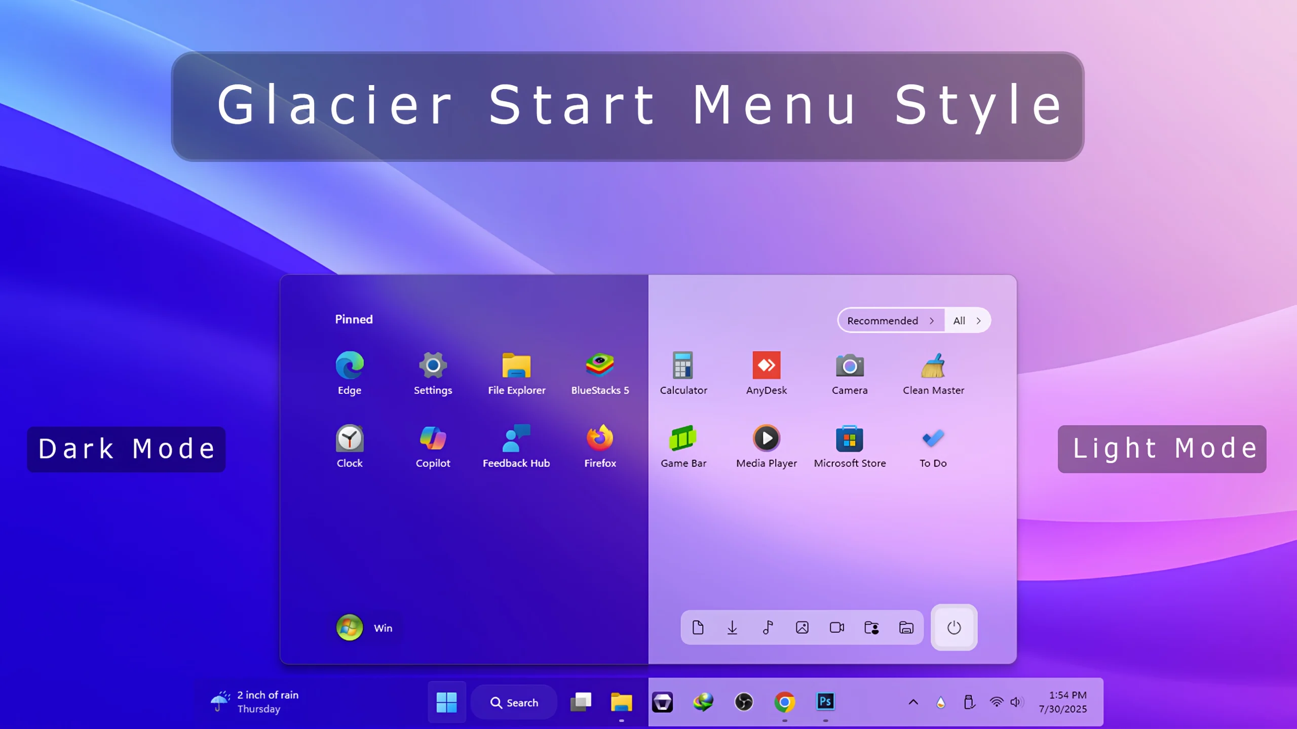
Glacier Start Menu:Experience a sleek, frosty transformation with the Glacier Start Menu Style for Windows 11, powered by Windhawk.

Glacier Start Menu Style For Windows 11
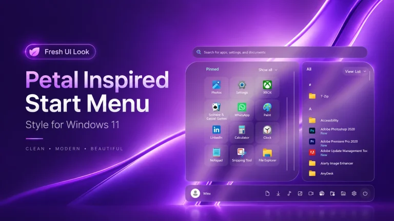
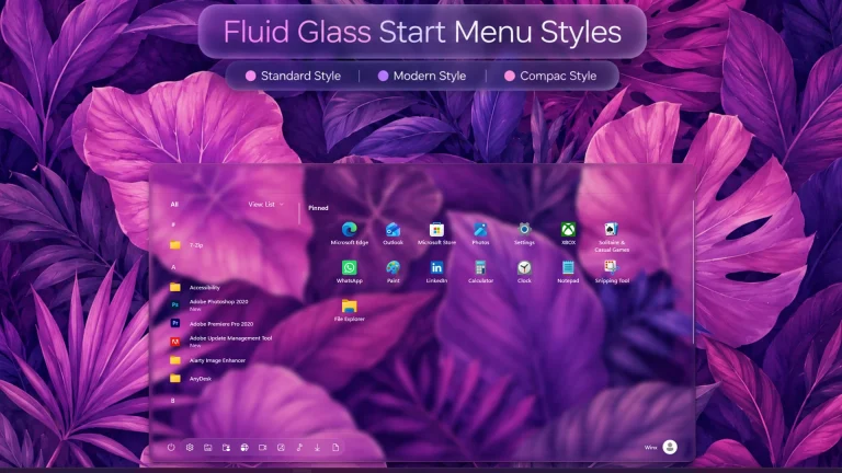
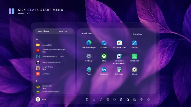
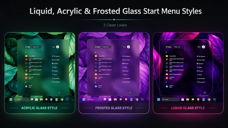
Experience a sleek, frosty transformation with the Glacier Start Menu Style for Windows 11, powered by Windhawk. This custom mod redefines your Start Menu with a cool, ice-themed aesthetic—perfect for users who love a minimal, elegant interface with a modern edge..
The Glacier theme introduces semi-transparent frosted glass effects, icy-blue highlights, soft blur backgrounds, and smooth rounded corners. Whether you’re a fan of Fluent Design or want your Start Menu to stand out with a refined look, this mod offers a perfect balance of performance and visual charm. Thanks to Windhawk’s real-time injection engine, applying the Glacier Start Menu style is seamless and doesn’t require system file replacement or risky patches
Fully compatible with Windows 11 22H2 and later, this Start Menu mod is ideal for creators, gamers, and productivity lovers who appreciate detail and style. You can pair it with matching wallpapers, Rainmeter widgets, and custom icons to build a cohesive, icy desktop environment
- Windows 11 21H2: Yes
- Windows 11 22H2: Yes
- Windows 11 23H2: Yes
- Windows 11 24H2: Yes
- Windows 11 25H2: Yes, but test carefully after Windows updates.
- Download and install Windhawk
- Open Windhawk and install the Windows 11 Start Menu Styler mod
- Go to the Advanced tab
- Paste the provided configuration code into the “Mod settings” box
- Click Save to apply the style
- For more details, visit this GitHub guide
{ "theme": "Down Aero", "controlStyles[0].target": "Grid#FrameRoot", "controlStyles[0].styles[0]": "MaxHeight=450", "controlStyles[0].styles[1]": "Height=450", "controlStyles[1].target": "Grid#MainMenu", "controlStyles[1].styles[0]": "Width=850", "controlStyles[1].styles[1]": "MinWidth=850", "controlStyles[1].styles[2]": "MaxWidth=850", "controlStyles[2].target": "Grid#TopLevelSuggestionsListHeader", "controlStyles[2].styles[0]": "Height=0", "controlStyles[2].styles[1]": "Visibility=>showMoreSuggestionsVisible", "controlStyles[3].target": "Grid#ShowMoreSuggestions", "controlStyles[3].styles[0]": "Visibility={{showMoreSuggestionsVisible}}", "controlStyles[4].target": "Button#ShowMoreSuggestionsButton", "controlStyles[4].styles[0]": "Margin=0,-77,147,0", "controlStyles[5].target": "Grid#NoTopLevelSuggestionsText", "controlStyles[5].styles[0]": "Height=0", "controlStyles[6].target": "Button#ShowMoreSuggestionsButton > Grid > ContentPresenter > StackPanel > TextBlock", "controlStyles[6].styles[0]": "Text=Recommended", "controlStyles[6].styles[1]": "Visibility=Visible", "controlStyles[7].target": "StartMenu.PinnedList#StartMenuPinnedList", "controlStyles[7].styles[0]": "Height=340", "controlStyles[7].styles[1]": "MaxHeight=340", "controlStyles[7].styles[2]": "Margin=0,15,12,80", "controlStyles[8].target": "StartMenu.SearchBoxToggleButton", "controlStyles[8].styles[0]": "Visibility=Collapsed", "controlStyles[8].styles[1]": "Height=0", "controlStyles[9].target": "Border#AcrylicBorder", "controlStyles[9].styles[0]": "CornerRadius=10", "controlStyles[9].styles[1]": "Background:=<AcrylicBrush TintColor=\"{ThemeResource CardStrokeColorDefaultSolid}\" FallbackColor=\"{ThemeResource CardStrokeColorDefaultSolid}\" TintOpacity=\"0\" TintLuminosityOpacity=\".5\" Opacity=\"1\"/>", "controlStyles[10].target": "Border#AcrylicOverlay", "controlStyles[10].styles[0]": "CornerRadius=10", "controlStyles[10].styles[1]": "Background:=<AcrylicBrush TintColor=\"{ThemeResource CardStrokeColorDefaultSolid}\" FallbackColor=\"{ThemeResource CardStrokeColorDefaultSolid}\" TintOpacity=\"0\" TintLuminosityOpacity=\"1\" Opacity=\"1\"/>", "controlStyles[10].styles[2]": "Height=430", "controlStyles[10].styles[3]": "Margin=0,-65,0,0", "controlStyles[11].target": "Border#DropShadow", "controlStyles[11].styles[0]": "CornerRadius=10", "controlStyles[12].target": "Border#StartDropShadow", "controlStyles[12].styles[0]": "CornerRadius=10", "controlStyles[13].target": "Grid#MainContent", "controlStyles[13].styles[0]": "Grid.Row=0", "controlStyles[13].styles[1]": "VerticalAlignment=0", "controlStyles[13].styles[2]": "MinHeight=Auto", "controlStyles[14].target": "Windows.UI.Xaml.Controls.GridView#RecommendedList", "controlStyles[14].styles[0]": "Visibility=Collapsed", "controlStyles[15].target": "Grid#TopLevelSuggestionsRoot", "controlStyles[15].styles[0]": "Grid.Row=1", "controlStyles[16].target": "GridView#AllAppsGrid", "controlStyles[16].styles[0]": "Margin=0,0,0,40", "controlStyles[17].target": "GridView#AllAppsGrid > Border > ScrollViewer > Border > Grid > ScrollContentPresenter > ItemsPresenter > ItemsWrapGrid", "controlStyles[17].styles[0]": "Margin=45,-180,45,0", "controlStyles[18].target": "TextBlock#AllListHeadingText", "controlStyles[18].styles[0]": "Margin=63,-184,12,0", "controlStyles[19].target": "Grid#TopLevelHeader > Grid > Button[AutomationProperties.Name=Show all] > Grid@CommonStates > Border", "controlStyles[19].styles[0]": "Background@Normal:=<SolidColorBrush Color=\"{ThemeResource SystemChromeAltHighColor}\" Opacity=\".8\"/>", "controlStyles[19].styles[1]": "Background@PointerOver:=<SolidColorBrush Color=\"{ThemeResource SystemBaseLowColor}\" Opacity=\"1\"/>", "controlStyles[19].styles[2]": "Padding=10,7", "controlStyles[19].styles[3]": "Margin=0,0,-5,0", "controlStyles[19].styles[4]": "CornerRadius=0,15,15,0", "controlStyles[19].styles[5]": "BorderThickness=0", "controlStyles[19].styles[6]": "Width=85", "controlStyles[20].target": "Button#ShowMoreSuggestionsButton > Grid@CommonStates > Border", "controlStyles[20].styles[0]": "Background@Normal:=<SolidColorBrush Color=\"{ThemeResource SystemAltMediumLowColor}\" Opacity=\"0\"/>", "controlStyles[20].styles[1]": "BorderBrush@Normal:=<SolidColorBrush Color=\"{ThemeResource SystemChromeAltHighColor}\" Opacity=\".8\"/>", "controlStyles[20].styles[2]": "Padding=10,5", "controlStyles[20].styles[3]": "Margin=0,0,-2,0", "controlStyles[20].styles[4]": "CornerRadius=15,0,0,15", "controlStyles[20].styles[5]": "BorderThickness=2,2,0,2", "controlStyles[20].styles[6]": "Background@PointerOver:=<SolidColorBrush Color=\"{ThemeResource SystemBaseLowColor}\" Opacity=\".7\"/>", "controlStyles[20].styles[7]": "BorderBrush@PointerOver:=<SolidColorBrush Color=\"{ThemeResource SystemBaseLowColor}\" Opacity=\"1\"/>", "controlStyles[21].target": "Microsoft.UI.Xaml.Controls.DropDownButton > Grid@CommonStates", "controlStyles[21].styles[0]": "BorderBrush:=<SolidColorBrush Color=\"{ThemeResource SystemChromeAltHighColor}\" Opacity=\".8\"/>", "controlStyles[21].styles[1]": "Background:=<SolidColorBrush Color=\"{ThemeResource SystemAltMediumLowColor}\" Opacity=\"1\"/>", "controlStyles[21].styles[2]": "BorderThickness={{showMoreSuggestionsVisible*2}},2,2,2", "controlStyles[21].styles[3]": "CornerRadius={{showMoreSuggestionsVisible*15}},15,15,{{showMoreSuggestionsVisible*15}}", "controlStyles[21].styles[4]": "Height=32", "controlStyles[22].target": "StartDocked.AppListView#NavigationPanePlacesListView > Border", "controlStyles[22].styles[0]": "Background:=<AcrylicBrush TintColor=\"{ThemeResource CardStrokeColorDefaultSolid}\" FallbackColor=\"{ThemeResource CardStrokeColorDefaultSolid}\" TintOpacity=\"0\" TintLuminosityOpacity=\".5\" Opacity=\"1\"/>", "controlStyles[22].styles[1]": "CornerRadius=10", "controlStyles[22].styles[2]": "Margin=0,0,15,0", "controlStyles[23].target": "StartDocked.NavigationPaneButton#PowerButton > Grid@CommonStates > Border#BackgroundBorder", "controlStyles[23].styles[0]": "Background:=<AcrylicBrush TintColor=\"{ThemeResource CardStrokeColorDefaultSolid}\" FallbackColor=\"{ThemeResource CardStrokeColorDefaultSolid}\" TintOpacity=\"0\" TintLuminosityOpacity=\"1\" Opacity=\"1\"/>", "controlStyles[23].styles[1]": "BorderBrush@Normal:=<AcrylicBrush TintColor=\"{ThemeResource SurfaceStrokeColorDefault}\" FallbackColor=\"{ThemeResource SurfaceStrokeColorDefault}\" TintOpacity=\"0\" TintLuminosityOpacity=\".1\" Opacity=\"1\"/>", "controlStyles[23].styles[2]": "CornerRadius=10", "controlStyles[23].styles[3]": "BorderThickness=5", "controlStyles[23].styles[4]": "Margin=-7", "controlStyles[23].styles[5]": "BorderBrush@PointerOver:=<AcrylicBrush TintColor=\"{ThemeResource SystemAccentColor}\" FallbackColor=\"{ThemeResource SystemAccentColor}\" TintOpacity=\".8\" TintLuminosityOpacity=\".5\" Opacity=\"1\"/>", "controlStyles[24].target": "StartDocked.NavigationPaneButton#UserTileButton > Grid > Border#BackgroundBorder", "controlStyles[24].styles[0]": "Background:=<AcrylicBrush TintColor=\"{ThemeResource CardStrokeColorDefaultSolid}\" FallbackColor=\"{ThemeResource CardStrokeColorDefaultSolid}\" TintOpacity=\"0\" TintLuminosityOpacity=\".5\" Opacity=\"1\"/>", "controlStyles[24].styles[1]": "CornerRadius=10", "controlStyles[25].target": "StartDocked.NavigationPaneView > Grid#RootPanel", "controlStyles[25].styles[0]": "Grid.Row=2", "controlStyles[26].target": "Grid#MainMenu > Grid#MainContent > Grid", "controlStyles[26].styles[0]": "Canvas.ZIndex=1", "disableNewStartMenuLayout": "forceNewLayout"}Disclaimer
This customization is intended for personal Windows 11 appearance and interface modification only. The Glacier Start Menu Style is not an official Microsoft product, theme, or feature, and Link Vegas Theme is not affiliated with or endorsed by Microsoft.
Compatibility may vary depending on your Windows version, Windhawk version, installed mods, display scaling, and future Windows updates. Some interface elements may change or stop working correctly after a system update.
Before applying any custom Windhawk configuration, we recommend creating a System Restore Point and backing up your existing settings. Apply modifications carefully and at your own discretion.
All product names, trademarks, and registered trademarks mentioned on this page belong to their respective owners.
Final Words
The Glacier Start Menu Style is a great choice for Windows 11 users who want a cleaner, modern, and more visually refined Start Menu. Its glass-inspired background, smooth transparency, rounded elements, and organized layout help create a premium desktop appearance without making the interface feel cluttered.
If you enjoy customizing Windows with Windhawk, this style can be a strong addition to your setup. You can also adjust the blur, tint, spacing, colors, and other visual details to better match your wallpaper and overall desktop theme.
Before applying major customization changes, keep a backup of your current Windhawk settings and consider creating a System Restore Point. This makes it easier to return to your previous setup if a Windows update or configuration change causes compatibility issues.
With the right wallpaper, taskbar style, and matching visual elements, the Glacier Start Menu Style can give Windows 11 a fresh, elegant, and personalized look.