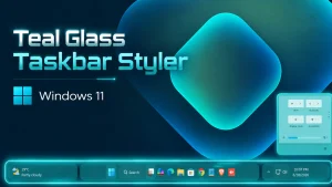
Teal Glass Windows 11 Taskbar Style
Customize your desktop with the Teal Glass Windows 11 Taskbar Style, a modern Windhawk Taskbar Styler mod featuring transparent effects, teal accents, and a clean glass-inspired appearance.

Teal Glass Windows 11 Taskbar Style – A Modern Windhawk Taskbar Mod
The Teal Glass Windows 11 Taskbar Style gives the standard Windows 11 taskbar a cleaner, more modern, and visually appealing appearance. It combines a teal color palette with a transparent glass effect, creating a desktop style that feels fresh without making the interface difficult to use.
This customization is designed for the Windhawk Taskbar Styler mod. It is not a complete Windows theme or a standalone application. Instead, it changes the appearance of the existing Windows 11 taskbar through Windhawk, allowing you to keep the familiar taskbar functions while improving its visual design.
About the Teal Glass Windows 11 Taskbar Style
The Teal Glass Windows 11 Taskbar Style uses transparent backgrounds, soft borders, rounded elements, and teal-inspired accents to create a glass-like taskbar. The design works well with ocean, nature, abstract, dark, and minimal desktop wallpapers.
The style is intended for users who enjoy customizing Windows 11 but still want a practical desktop layout. It focuses mainly on visual improvements, so your Start button, pinned applications, system tray, clock, and taskbar controls remain available as usual.
Main Features of This Windhawk Taskbar Style
- Modern teal and glass-inspired taskbar appearance
- Transparent or semi-transparent visual elements
- Clean rounded corners and smooth spacing
- Designed for the Windhawk Taskbar Styler mod
- Suitable for dark and colorful Windows wallpapers
- Maintains access to normal Windows 11 taskbar functions
- Can be removed by disabling the Windhawk mod
- No permanent Windows system-file replacement is intended
- 21H2 Yes
- 22H2 Yes
- 22H3 Yes
- 24H2 Yes
- 25H2 Yes
- Download and install Windhawk.
- Install and open the Windows 11 Taskbar Styler mod in Windhawk.
- Go to the Settings tab and select Textual mode.
- Copy the content below and paste it into the text box.
- Click Save settings to apply the Dox Taskbar Style.
theme: ''styleConstants: - TaskbarGlass=<AcrylicBrush TintColor="#1AABAB" FallbackColor="#991AABAB" TintOpacity="0.55" TintLuminosityOpacity="0.55" Opacity="1"/> - TrayGlass=<AcrylicBrush TintColor="#1AABAB" FallbackColor="#771AABAB" TintOpacity="0.42" TintLuminosityOpacity="0.66" Opacity="1"/> - WidgetGlass=<AcrylicBrush TintColor="#1AABAB" FallbackColor="#991AABAB" TintOpacity="0.55" TintLuminosityOpacity="0.55" Opacity="1"/> - HoverGlass=<SolidColorBrush Color="#331AABAB" /> - PressGlass=<SolidColorBrush Color="#551AABAB" /> - BorderSoft=<SolidColorBrush Color="#881AABAB" /> - WhiteText=<SolidColorBrush Color="#FFFFFFFF" /> - SoftWhite=<SolidColorBrush Color="#DDFFFFFF" /> - TaskbarRadius=18 - TrayRadius=18 - ButtonRadius=12 - WidgetRadius=10controlStyles: - target: Grid#RootGrid > Taskbar.TaskbarBackground > Grid styles: - Margin=540,0,540,2 - Background:=$TaskbarGlass - BorderBrush:=$BorderSoft - CornerRadius=$TaskbarRadius - BorderThickness=1 - target: Grid#SystemTrayFrameGrid styles: - Margin=0,0,275,2 - CornerRadius=5,25,25,5 - Background:=$TrayGlass - BorderBrush:=$BorderSoft - BorderThickness=1 - Padding=10,0,0,0 - Width=260 - target: Taskbar.AugmentedEntryPointButton#AugmentedEntryPointButton > Taskbar.TaskListButtonPanel#ExperienceToggleButtonRootPanel styles: - Margin=273,0,0,2 - Width=260 - Background:=$WidgetGlass - CornerRadius=25,5,5,25 - BorderBrush:=$BorderSoft - BorderThickness=1 - target: Taskbar.AugmentedEntryPointButton#AugmentedEntryPointButton > Taskbar.TaskListButtonPanel#ExperienceToggleButtonRootPanel > Border#BackgroundElement styles: - Background:=$WidgetGlass - Margin=-4 - BorderBrush:=$BorderSoft - BorderThickness=1 - CornerRadius=25,5,5,25 - target: Taskbar.ExperienceToggleButton#LaunchListButton > Taskbar.TaskListButtonPanel#ExperienceToggleButtonRootPanel styles: - Background:=$WidgetGlass - CornerRadius=$WidgetRadius - BorderBrush:=$BorderSoft - BorderThickness=1 - target: Taskbar.ExperienceToggleButton#LaunchListButton > Taskbar.TaskListButtonPanel#ExperienceToggleButtonRootPanel > Border#BackgroundElement styles: - Background:=$WidgetGlass - BorderBrush:=$BorderSoft - BorderThickness=1 - CornerRadius=$WidgetRadius - target: Taskbar.ExperienceToggleButton#LaunchListButton Border#BackgroundElement styles: - Background:=$WidgetGlass - BorderBrush:=$BorderSoft - BorderThickness=1 - CornerRadius=$WidgetRadius - target: Rectangle#BackgroundFill styles: - Fill=Transparent - target: Rectangle#BackgroundStroke styles: - Fill=Transparent - target: Windows.UI.Xaml.Controls.Grid#AugmentedEntryPointContentGrid styles: - Margin=10,0,0,0 - HorizontalAlignment=Left - target: Taskbar.TaskListButtonPanel > Border#BackgroundElement styles: - Background@Normal:=<SolidColorBrush Color="#001AABAB"/> - Background@PointerOver:=$HoverGlass - Background@Pressed:=$PressGlass - CornerRadius=$ButtonRadius - BorderBrush@PointerOver:=$BorderSoft - BorderThickness=0 - target: Grid#SystemTrayFrameGrid TextBlock styles: - Foreground:=$WhiteText - target: Grid#SystemTrayFrameGrid FontIcon styles: - Foreground:=$WhiteText - target: Grid#SystemTrayFrameGrid SymbolIcon styles: - Foreground:=$WhiteText - target: Grid#SystemTrayFrameGrid PathIcon styles: - Foreground:=$WhiteText - target: TextBlock#InnerTextBlock styles: - Foreground:=$WhiteText - target: TextBlock#TimeInnerTextBlock styles: - Foreground:=$WhiteText - target: TextBlock#DateInnerTextBlock styles: - Foreground:=$SoftWhite - target: Taskbar.AugmentedEntryPointButton#AugmentedEntryPointButton TextBlock styles: - Foreground:=$WhiteText - target: Taskbar.AugmentedEntryPointButton#AugmentedEntryPointButton FontIcon styles: - Foreground:=$WhiteText - target: Taskbar.AugmentedEntryPointButton#AugmentedEntryPointButton SymbolIcon styles: - Foreground:=$WhiteText - target: Taskbar.ExperienceToggleButton#LaunchListButton TextBlock styles: - Foreground:=$WhiteText - target: Taskbar.ExperienceToggleButton#LaunchListButton FontIcon styles: - Foreground:=$WhiteText - target: Taskbar.ExperienceToggleButton#LaunchListButton SymbolIcon styles: - Foreground:=$WhiteTextthemeResourceVariables: - ''xamlDiagnosticsHandling: ''Theme: Teal Glass Taskbar Style by WinX CustomizationRequired Windhawk Mods Taskbar Hight & Icon Size for similar results
To achieve similar results, install and configure the following Windhawk mods in addition to Taskbar Styler
- Install and open the Taskbar height and icon size mod in Windhawk.
- Go to the Settings tab and select Textual mode.
- Copy the content below and paste it into the text box.
- Click Save settings to apply the Dox Taskbar Style.
TaskbarHeight: 55IconSize: 24TaskbarButtonWidth: 38IconSizeSmall: 20TaskbarButtonWidthSmall: 50Notification Center Style

theme: ''styleConstants: - WinXBackground=<WindhawkBlur BlurAmount="28" TintColor="#54EAF5" TintOpacity="0.72" /> - WinXBackgroundSoft=<WindhawkBlur BlurAmount="24" TintColor="#7AF7F4" TintOpacity="0.55" /> - WinXCard=<WindhawkBlur BlurAmount="20" TintColor="#B9FFFF" TintOpacity="0.38" /> - WinXCardHover=<WindhawkBlur BlurAmount="22" TintColor="#D8FFFF" TintOpacity="0.55" /> - WinXBorder=<LinearGradientBrush StartPoint="0,0" EndPoint="1,1"><GradientStop Color="#A6FFFFFF" Offset="0"/><GradientStop Color="#3D00E5FF" Offset="0.5"/><GradientStop Color="#66FFFFFF" Offset="1"/></LinearGradientBrush> - BlackBrush=<SolidColorBrush Color="#FF000000"/> - WinXRadius=26 - WinXSmallRadius=16 - WinXBorderThickness=1.2controlStyles: - target: //Grid styles: - RequestedTheme=1 - target: //Border styles: - RequestedTheme=1 - target: //Button styles: - RequestedTheme=1 - Foreground:=$BlackBrush - target: //ToggleButton styles: - RequestedTheme=1 - Foreground:=$BlackBrush - target: //TextBlock styles: - RequestedTheme=1 - Foreground:=$BlackBrush - Opacity=1 - target: //FontIcon styles: - Foreground:=$BlackBrush - Opacity=1 - target: //SymbolIcon styles: - Foreground:=$BlackBrush - Opacity=1 - target: //PathIcon styles: - Foreground:=$BlackBrush - Opacity=1 - target: Grid#NotificationCenterGrid styles: - RequestedTheme=1 - Background:=$WinXBackground - CornerRadius=$WinXRadius - BorderBrush:=$WinXBorder - BorderThickness=$WinXBorderThickness - Padding=14 - Margin=0,0,14,14 - Shadow:= - target: Grid#CalendarCenterGrid styles: - RequestedTheme=1 - Background:=$WinXBackground - CornerRadius=$WinXRadius - BorderBrush:=$WinXBorder - BorderThickness=$WinXBorderThickness - Padding=12 - Margin=0,8,14,14 - Shadow:= - target: Grid#ControlCenterRegion styles: - RequestedTheme=1 - Background:=$WinXBackground - CornerRadius=$WinXRadius - BorderBrush:=$WinXBorder - BorderThickness=$WinXBorderThickness - Padding=14 - Margin=0,0,14,14 - Shadow:= - target: Grid#NotificationCenterTopBanner styles: - RequestedTheme=1 - Background:=$WinXCard - CornerRadius=$WinXSmallRadius - BorderBrush:=$WinXBorder - BorderThickness=1 - Margin=6 - Shadow:= - target: ActionCenter.FocusSessionControl#FocusSessionControl > Grid#FocusGrid styles: - RequestedTheme=1 - Background:=$WinXCard - CornerRadius=$WinXSmallRadius - BorderBrush:=$WinXBorder - BorderThickness=1 - Margin=6 - Shadow:= - target: ActionCenter.FlexibleToastView#FlexibleNormalToastView styles: - RequestedTheme=1 - Background:=Transparent - Shadow:= - target: Border#ToastBackgroundBorder2 styles: - RequestedTheme=1 - Background:=$WinXCard - CornerRadius=$WinXSmallRadius - BorderBrush:=$WinXBorder - BorderThickness=1 - Shadow:= - target: ScrollViewer#CalendarControlScrollViewer styles: - RequestedTheme=1 - Background:=$WinXCard - CornerRadius=$WinXSmallRadius - BorderBrush:=$WinXBorder - BorderThickness=1 - Margin=-8,8,-8,-10 - Shadow:= - target: Border#CalendarHeaderMinimizedOverlay styles: - RequestedTheme=1 - Background:=$WinXCard - CornerRadius=$WinXSmallRadius - BorderBrush:=$WinXBorder - BorderThickness=1 - Height=46 - Margin=-8,-4,-8,-6 - Shadow:= - target: QuickActions.AccessibleToggleButton#ToggleButton styles: - RequestedTheme=1 - Background@Normal:=$WinXCard - Background@PointerOver:=$WinXCardHover - Background@Pressed:=$WinXBackgroundSoft - Foreground:=$BlackBrush - Foreground@Normal:=$BlackBrush - Foreground@PointerOver:=$BlackBrush - Foreground@Pressed:=$BlackBrush - Foreground@Selected:=$BlackBrush - CornerRadius=$WinXSmallRadius - BorderBrush:=$WinXBorder - BorderThickness=1 - Padding=8 - Shadow:= - target: QuickActions.AccessibleToggleButton#SplitL2Button styles: - RequestedTheme=1 - Background@Normal:=$WinXCard - Background@PointerOver:=$WinXCardHover - Background@Pressed:=$WinXBackgroundSoft - Foreground:=$BlackBrush - Foreground@Normal:=$BlackBrush - Foreground@PointerOver:=$BlackBrush - Foreground@Pressed:=$BlackBrush - Foreground@Selected:=$BlackBrush - CornerRadius=$WinXSmallRadius - BorderBrush:=$WinXBorder - BorderThickness=1 - Margin=4,0,-4,0 - Shadow:= - target: QuickActions.AccessibleToggleButton#ToggleButton //TextBlock styles: - Foreground:=$BlackBrush - Opacity=1 - target: QuickActions.AccessibleToggleButton#SplitL2Button //TextBlock styles: - Foreground:=$BlackBrush - Opacity=1 - target: QuickActions.AccessibleToggleButton#ToggleButton //FontIcon styles: - Foreground:=$BlackBrush - Opacity=1 - target: QuickActions.AccessibleToggleButton#ToggleButton //SymbolIcon styles: - Foreground:=$BlackBrush - Opacity=1 - target: QuickActions.AccessibleToggleButton#ToggleButton //PathIcon styles: - Foreground:=$BlackBrush - Opacity=1 - target: Grid#FooterGrid styles: - RequestedTheme=1 - Background:=Transparent - Margin=4,8,4,0 - target: Windows.UI.Xaml.Controls.Button#FooterButton[AutomationProperties.Name = All settings] styles: - RequestedTheme=1 - Background:=$WinXCard - Foreground:=$BlackBrush - CornerRadius=14 - BorderBrush:=$WinXBorder - BorderThickness=1 - target: Windows.UI.Xaml.Controls.Button#FooterButton[AutomationProperties.Name = Edit quick settings] styles: - RequestedTheme=1 - Background:=$WinXCard - Foreground:=$BlackBrush - CornerRadius=14 - BorderBrush:=$WinXBorder - BorderThickness=1 - Margin=0,0,8,0 - target: Windows.UI.Xaml.Shapes.Rectangle#HorizontalTrackRect styles: - Height=10 - Fill:=$WinXCard - RadiusX=5 - RadiusY=5 - target: Windows.UI.Xaml.Shapes.Rectangle#HorizontalDecreaseRect styles: - Height=10 - Fill=#00B7E8 - RadiusX=5 - RadiusY=5 - target: Windows.UI.Xaml.Controls.Primitives.Thumb#HorizontalThumb styles: - Visibility=1 - Width=18 - Height=18 - target: Windows.UI.Xaml.Controls.Grid#MediaTransportControlsRegion styles: - RequestedTheme=1 - Background:=$WinXBackgroundSoft - CornerRadius=$WinXRadius - BorderBrush:=$WinXBorder - BorderThickness=1 - Padding=10 - Margin=0,0,0,12 - Shadow:= - target: Windows.UI.Xaml.Controls.Grid#MediaTransportControlsRegion //TextBlock styles: - Foreground:=$BlackBrush - Opacity=1 - target: MenuFlyoutPresenter styles: - RequestedTheme=1 - Background:=$WinXBackground - CornerRadius=18 - BorderBrush:=$WinXBorder - BorderThickness=1 - Shadow:= - target: MenuFlyoutItem styles: - RequestedTheme=1 - Foreground:=$BlackBrush - target: CalendarViewDayItem styles: - RequestedTheme=1 - Foreground:=$BlackBrush - target: CalendarViewDayItem //TextBlock styles: - Foreground:=$BlackBrush - Opacity=1 - target: CalendarViewDayItem > Border styles: - CornerRadius=12 - target: Control > Border styles: - CornerRadius=12themeResourceVariables: - ''Theme: Teal Notification Center Style by WinX CustomizationIs This Style Safe for Windows 11?
Orbit Taskbar & Notification Center Style is mainly a visual customization setup. It is created to change the appearance of the taskbar and notification area, not to damage system files or personal data. However, you should always download Windhawk and any related files from trusted sources only.
Avoid unknown installers, modified system files, or suspicious download links. Keeping your Windows system updated and using trusted customization tools will help you enjoy a safer and smoother experience.
Final Thoughts
The Orbit Taskbar & Notification Center Style For Windows 11 is a clean and attractive option for users who want a modern desktop layout. With Windhawk Taskbar customization, you can turn the default Windows 11 taskbar into a rounded, floating, and stylish design that feels easy to use every day.
If you enjoy Windows 11 customization and want your desktop to look more unique, this Orbit style is definitely worth trying.
 9")


 – Modern Windows Taskbar Customization 13")


