

Azure Glass Settings Style for Windows 11
Give Windows 11 Settings a fresh, modern look with Azure Glass Settings Style for Windhawk, featuring elegant 3D blue glass cards, soft transparency, subtle hover effects, and a clean, polished interface.

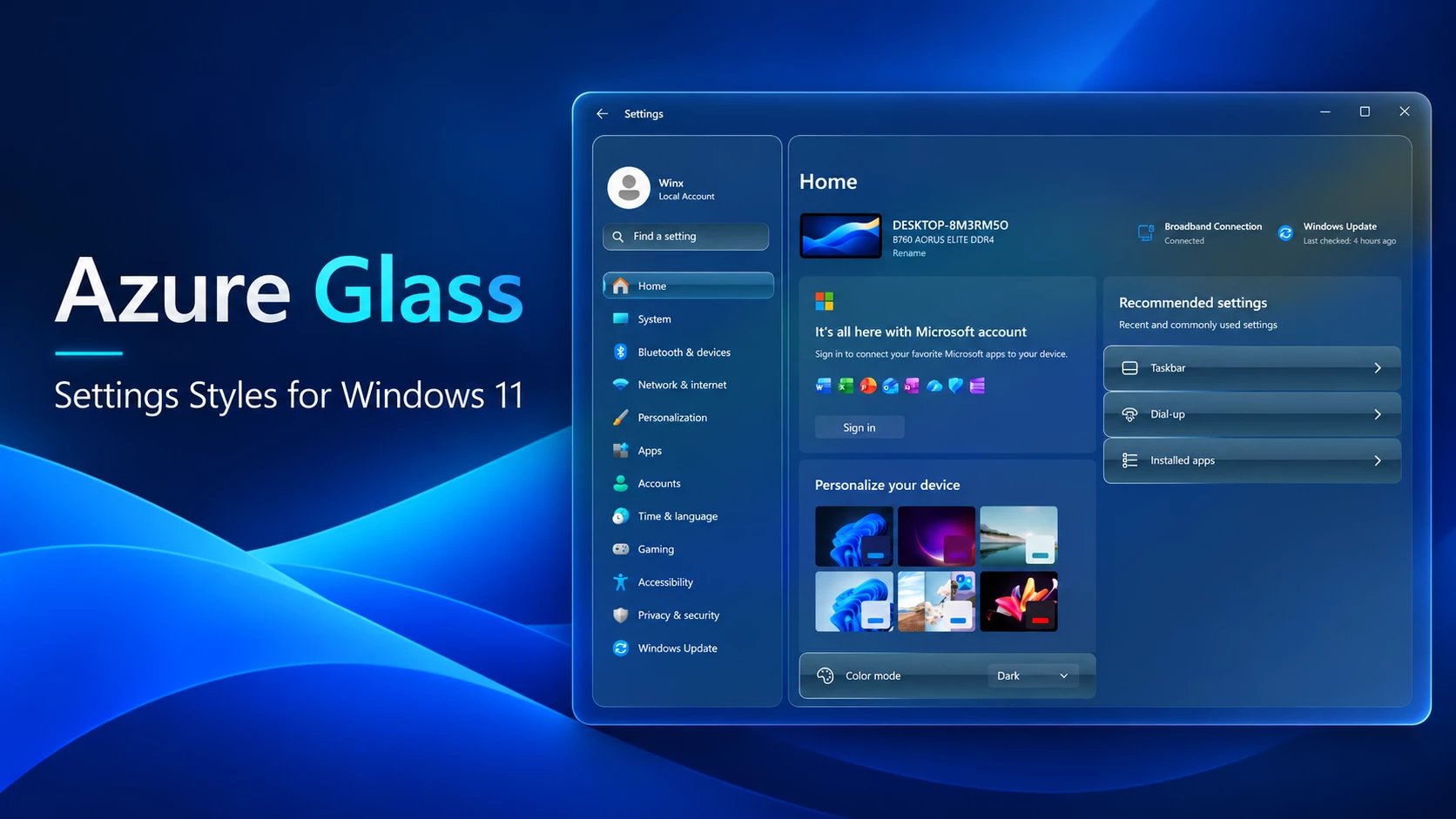
Azure Glass Settings Style for Windows 11
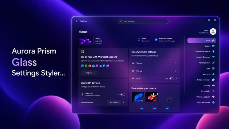
Want to give your Windows 11 Settings app a fresh look without making everything completely transparent? Azure Glass Settings Style brings a beautiful blue glass design to the familiar Windows Settings interface, with soft transparency, subtle 3D effects, and carefully styled cards.
The design focuses on creating a modern, comfortable appearance while keeping the Settings app easy to use. Its deep blue colors, gentle glass effects, and smooth-looking surfaces work together to give Windows 11 a more polished feel.
One of the most attractive parts of Azure Glass is its dimensional card styling. Instead of using flat, plain backgrounds, it adds a soft 3D glass appearance to navigation items, setting cards, and selected interface elements. The result feels modern without being overly bright or distracting.
What Makes Azure Glass Settings Style Special?
Azure Glass brings a clean and modern blue glass appearance to Windows 11 Settings. Its main highlight is the subtle 3D glass effect on navigation items and settings cards, featuring soft blue highlights, smooth borders, and a slightly raised look.
Instead of making the entire interface fully transparent, it uses gentle transparency with rich blue tones to maintain a comfortable and readable layout. The left navigation panel and main settings cards blend naturally with the overall design.
Interactive elements also feature elegant blue glass hover effects, adding a touch of depth without making the interface look too flashy. With rounded corners, balanced colors, and a polished finish, Azure Glass gives Windows 11 Settings a fresh and stylish appearance.
Why Choose Azure Glass Settings Style for Windows 11?
There are many ways to customize the appearance of Windows 11, but not every style offers a good balance between appearance and usability.
Some designs use heavy transparency, strong lighting, or complicated visual elements. While those effects may look interesting, they can sometimes make everyday settings harder to read.
Azure Glass follows a simpler approach. It keeps the recognizable Windows 11 Settings layout and adds visual improvements through blue colors, soft transparency, and dimensional card effects.
The result is a clean design that feels comfortable for everyday use. If you prefer blue-themed Windows customization with a little extra depth, Azure Glass is worth trying.
Key Features of Azure Glass Settings Style
- Azure-blue design: A combination of deep blue and soft cyan tones.
- 3D glass-style cards: Layered highlights and borders create a gentle raised appearance.
- Soft transparency: A lightly transparent finish without making the entire interface see-through.
- Subtle hover styling: Blue glass-inspired highlights on supported interactive elements.
- Rounded corners: Smooth card edges that complement Windows 11.
- Styled navigation panel: A consistent blue appearance with clear selection highlights.
- Readable interface: Darker surfaces help maintain contrast between text and backgrounds.
- Minimal appearance: A balanced design without unnecessary decorative elements.
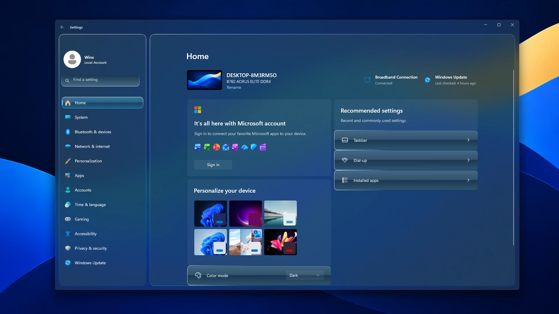
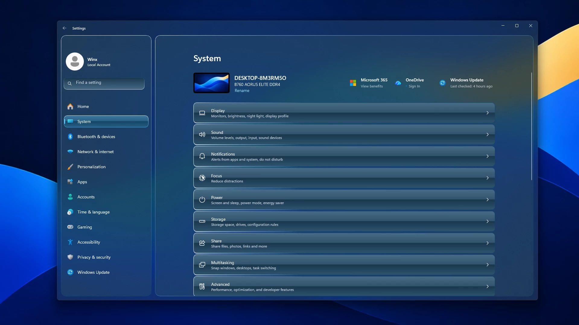
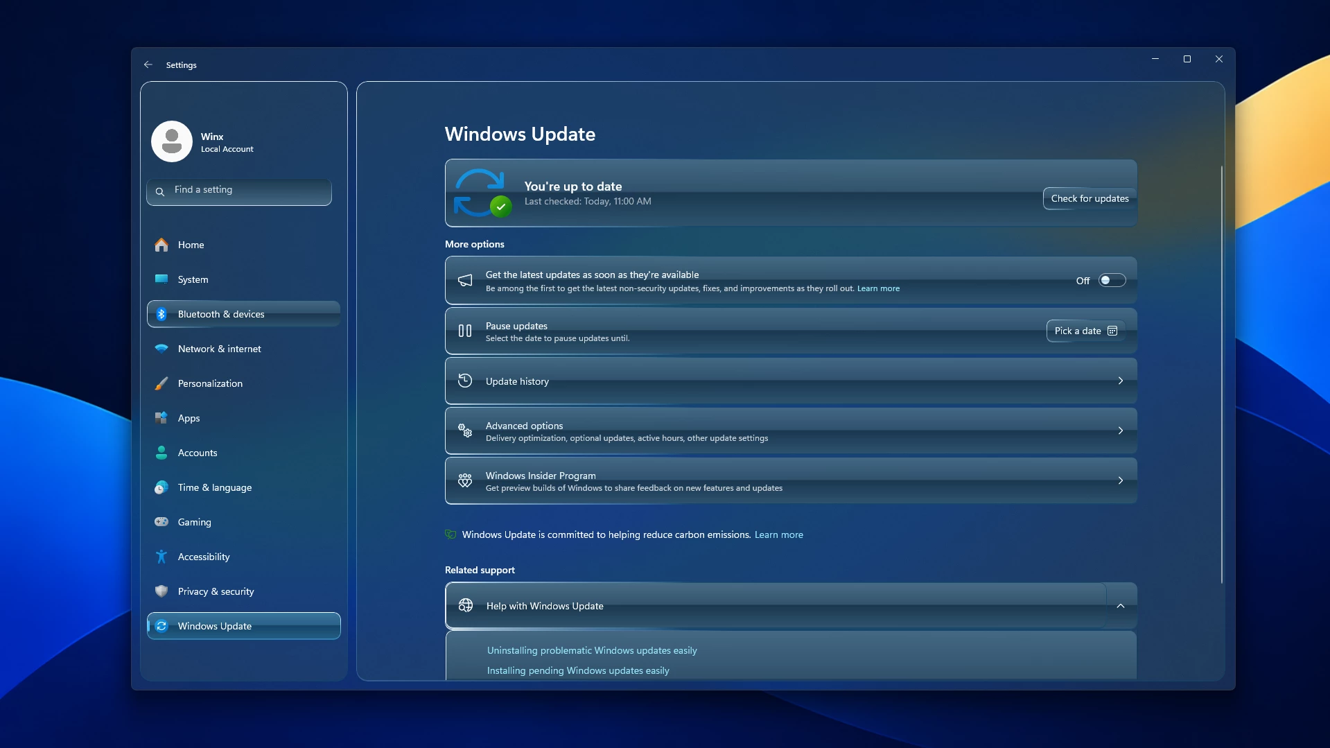
Preview
Compatibility
- Windows 11 21H2: Not Tested
- Windows 11 22H2: Not Tested
- Windows 11 23H2: Not Tested
- Windows 11 24H2: Not Tested
- Windows 11 25H2: YES.
- Tested On Windows 11 26H2: BUILD 26300.9457.
Installation steps:
- Before making changes, I recommend creating a System Restore Point so you can restore Windows if something goes wrong.
- Download and install Windhawk.
- Install and open the Windows 11 Settings Styler mod from Windhawk.
- Open the mod settings and go to the Advanced tab.
- Copy the style code provided below, paste it into the styling editor, and click “Save”.
- For more details, visit the official GitHub styling guide.
- For more Windhawk customization styles, visit My Windhawk Category.
{ "theme": "Azure Glass Settings Style By Link Vegas", "styleConstants[0]": "OutRadius=16", "styleConstants[1]": "InRadius=10", "styleConstants[2]": "SidebarWidth=320", "styleConstants[3]": "AeroGlass=<AcrylicBrush BackgroundSource=\"HostBackdrop\" TintColor=\"{ThemeResource AeroTint}\" TintOpacity=\"0.36\" TintLuminosityOpacity=\"0.82\" FallbackColor=\"{ThemeResource AeroFallback}\" />", "styleConstants[4]": "PanelGlass=<AcrylicBrush BackgroundSource=\"Backdrop\" TintColor=\"{ThemeResource AeroPanelMid}\" TintOpacity=\"0.45\" TintLuminosityOpacity=\"0.55\" FallbackColor=\"{ThemeResource AeroFallback}\" />", "styleConstants[5]": "TileGlass=<LinearGradientBrush StartPoint=\"0,0\" EndPoint=\"0,1\"><GradientStop Color=\"{ThemeResource AeroTileTop}\" Offset=\"0\"/><GradientStop Color=\"{ThemeResource AeroTileMid}\" Offset=\"0.48\"/><GradientStop Color=\"{ThemeResource AeroTileBase}\" Offset=\"0.50\"/><GradientStop Color=\"{ThemeResource AeroTileLow}\" Offset=\"1\"/></LinearGradientBrush>", "styleConstants[6]": "HoverGlass=<LinearGradientBrush StartPoint=\"0,0\" EndPoint=\"0,1\"><GradientStop Color=\"{ThemeResource AeroHoverTop}\" Offset=\"0\"/><GradientStop Color=\"{ThemeResource AeroHoverMid}\" Offset=\"0.48\"/><GradientStop Color=\"{ThemeResource AeroHoverBase}\" Offset=\"0.50\"/><GradientStop Color=\"{ThemeResource AeroHoverLow}\" Offset=\"1\"/></LinearGradientBrush>", "styleConstants[7]": "PressedGlass=<LinearGradientBrush StartPoint=\"0,0\" EndPoint=\"0,1\"><GradientStop Color=\"{ThemeResource AeroTileBase}\" Offset=\"0\"/><GradientStop Color=\"{ThemeResource AeroTileMid}\" Offset=\"1\"/></LinearGradientBrush>", "styleConstants[8]": "SearchGlass=<LinearGradientBrush StartPoint=\"0,0\" EndPoint=\"0,1\"><GradientStop Color=\"{ThemeResource AeroTileBase}\" Offset=\"0\"/><GradientStop Color=\"{ThemeResource AeroTileTop}\" Offset=\"1\"/></LinearGradientBrush>", "styleConstants[9]": "GlassEdge=<LinearGradientBrush StartPoint=\"0,0\" EndPoint=\"0.35,1\"><GradientStop Color=\"#F2FFFFFF\" Offset=\"0\"/><GradientStop Color=\"#A6D7F2FF\" Offset=\"0.18\"/><GradientStop Color=\"#7373AFD0\" Offset=\"0.65\"/><GradientStop Color=\"#BF15476A\" Offset=\"1\"/></LinearGradientBrush>", "styleConstants[10]": "InsetEdge=<LinearGradientBrush StartPoint=\"0,0\" EndPoint=\"0,1\"><GradientStop Color=\"#BF15476A\" Offset=\"0\"/><GradientStop Color=\"#9984B6D0\" Offset=\"0.45\"/><GradientStop Color=\"#D9FFFFFF\" Offset=\"1\"/></LinearGradientBrush>", "styleConstants[11]": "HoverEdge=<LinearGradientBrush StartPoint=\"0,0\" EndPoint=\"0,1\"><GradientStop Color=\"#FFFFFFFF\" Offset=\"0\"/><GradientStop Color=\"#E6A4E5FF\" Offset=\"0.4\"/><GradientStop Color=\"#E62883B5\" Offset=\"1\"/></LinearGradientBrush>", "styleConstants[12]": "PearlGlass=<LinearGradientBrush StartPoint=\"0,0\" EndPoint=\"0,1\"><GradientStop Color=\"#FFFFFFFF\" Offset=\"0\"/><GradientStop Color=\"#FFDEF4FF\" Offset=\"0.48\"/><GradientStop Color=\"#FF9CC8DE\" Offset=\"0.52\"/><GradientStop Color=\"#FFF3FCFF\" Offset=\"1\"/></LinearGradientBrush>", "controlStyles[0].target": "SystemSettings.View.RootPage > Grid#RootPageGrid", "controlStyles[0].styles[0]": "Background:=$AeroGlass", "controlStyles[1].target": "Microsoft.UI.Xaml.Controls.NavigationView#PermanentNavigationView", "controlStyles[1].styles[0]": "Background=Transparent", "controlStyles[1].styles[1]": "OpenPaneLength=$SidebarWidth", "controlStyles[2].target": "SplitView#RootSplitView", "controlStyles[2].styles[0]": "PaneBackground=Transparent", "controlStyles[2].styles[1]": "OpenPaneLength=$SidebarWidth", "controlStyles[3].target": "SplitView#RootSplitView > Grid > Grid#PaneRoot", "controlStyles[3].styles[0]": "Margin=0", "controlStyles[3].styles[1]": "Background=Transparent", "controlStyles[3].styles[2]": "BorderThickness=0", "controlStyles[4].target": "SplitView#RootSplitView > Grid > Grid#PaneRoot > Border", "controlStyles[4].styles[0]": "Margin=12,48,8,12", "controlStyles[4].styles[1]": "CornerRadius=$OutRadius", "controlStyles[4].styles[2]": "Background:=$PanelGlass", "controlStyles[4].styles[3]": "BorderBrush:=$GlassEdge", "controlStyles[4].styles[4]": "BorderThickness=1,1,1,2", "controlStyles[5].target": "SplitView#RootSplitView > Grid > Grid#PaneRoot > Border > Grid#PaneContentGrid", "controlStyles[5].styles[0]": "Width=Auto", "controlStyles[5].styles[1]": "MinWidth=0", "controlStyles[5].styles[2]": "HorizontalAlignment=Stretch", "controlStyles[6].target": "Grid#PaneContentGrid > Grid#ItemsContainerGrid", "controlStyles[6].styles[0]": "Width=Auto", "controlStyles[6].styles[1]": "MinWidth=0", "controlStyles[6].styles[2]": "HorizontalAlignment=Stretch", "controlStyles[6].styles[3]": "Margin=0,70,0,0", "controlStyles[7].target": "SplitView#RootSplitView > Grid > Grid#ContentRoot", "controlStyles[7].styles[0]": "Background=Transparent", "controlStyles[8].target": "SplitView#RootSplitView > Grid > Grid#ContentRoot > Border", "controlStyles[8].styles[0]": "Background=Transparent", "controlStyles[9].target": "SplitView#RootSplitView > Grid > Grid#ContentRoot > Border > Grid#ContentGrid", "controlStyles[9].styles[0]": "Margin=4,48,14,12", "controlStyles[9].styles[1]": "CornerRadius=$OutRadius", "controlStyles[9].styles[2]": "Background:=$PanelGlass", "controlStyles[9].styles[3]": "BorderBrush:=$GlassEdge", "controlStyles[9].styles[4]": "BorderThickness=1,1,1,2", "controlStyles[10].target": "Frame#PermanentNavRootFrame", "controlStyles[10].styles[0]": "Background=Transparent", "controlStyles[11].target": "SystemSettings.View.SettingsNavigationViewItem", "controlStyles[11].styles[0]": "MinHeight=44", "controlStyles[11].styles[1]": "MinWidth=0", "controlStyles[11].styles[2]": "Width=Auto", "controlStyles[11].styles[3]": "HorizontalAlignment=Stretch", "controlStyles[11].styles[4]": "HorizontalContentAlignment=Stretch", "controlStyles[11].styles[5]": "Margin=6,3,6,3", "controlStyles[11].styles[6]": "CornerRadius=$InRadius", "controlStyles[12].target": "SystemSettings.View.SettingsNavigationViewItem > Grid#NVIRootGrid", "controlStyles[12].styles[0]": "Width=Auto", "controlStyles[12].styles[1]": "MinWidth=0", "controlStyles[12].styles[2]": "Margin=0", "controlStyles[12].styles[3]": "HorizontalAlignment=Stretch", "controlStyles[13].target": "SystemSettings.View.SettingsNavigationViewItem > Grid#NVIRootGrid > Microsoft.UI.Xaml.Controls.Primitives.NavigationViewItemPresenter#NavigationViewItemPresenter > Grid#LayoutRoot@PointerStates", "controlStyles[13].styles[0]": "CornerRadius=$InRadius", "controlStyles[13].styles[1]": "BorderThickness=1,1,1,2", "controlStyles[13].styles[2]": "Background@Normal=Transparent", "controlStyles[13].styles[3]": "BorderBrush@Normal=Transparent", "controlStyles[13].styles[4]": "Background@PointerOver:=$TileGlass", "controlStyles[13].styles[5]": "BorderBrush@PointerOver:=$GlassEdge", "controlStyles[13].styles[6]": "Background@Pressed:=$PressedGlass", "controlStyles[13].styles[7]": "BorderBrush@Pressed:=$InsetEdge", "controlStyles[13].styles[8]": "Background@Selected:=$HoverGlass", "controlStyles[13].styles[9]": "BorderBrush@Selected:=$HoverEdge", "controlStyles[13].styles[10]": "Background@PointerOverSelected:=$HoverGlass", "controlStyles[13].styles[11]": "BorderBrush@PointerOverSelected:=$HoverEdge", "controlStyles[13].styles[12]": "Background@PressedSelected:=$PressedGlass", "controlStyles[13].styles[13]": "BorderBrush@PressedSelected:=$InsetEdge", "controlStyles[14].target": "Grid#RootCommandSearchGrid", "controlStyles[14].styles[0]": "Margin=21,180,0,0", "controlStyles[14].styles[1]": "HorizontalAlignment=Left", "controlStyles[14].styles[2]": "VerticalAlignment=Top", "controlStyles[14].styles[3]": "Width=268", "controlStyles[14].styles[4]": "CornerRadius=$InRadius", "controlStyles[15].target": "StackPanel#SettingsCommandSearchBoxBackground", "controlStyles[15].styles[0]": "Background=Transparent", "controlStyles[15].styles[1]": "CornerRadius=$InRadius", "controlStyles[16].target": "TextBox#CommandSearchTextBox", "controlStyles[16].styles[0]": "MinHeight=40", "controlStyles[16].styles[1]": "CornerRadius=$InRadius", "controlStyles[16].styles[2]": "Margin=0", "controlStyles[16].styles[3]": "Background:=$SearchGlass", "controlStyles[16].styles[4]": "BorderBrush:=$InsetEdge", "controlStyles[16].styles[5]": "BorderThickness=1", "controlStyles[16].styles[6]": "Width=268", "controlStyles[16].styles[7]": "MaxWidth=268", "controlStyles[16].styles[8]": "HorizontalAlignment=Left", "controlStyles[17].target": "TextBox#CommandSearchTextBox > Grid@CommonStates > Border#BorderElement", "controlStyles[17].styles[0]": "CornerRadius=$InRadius", "controlStyles[17].styles[1]": "Background@Normal:=$SearchGlass", "controlStyles[17].styles[2]": "Background@PointerOver:=$SearchGlass", "controlStyles[17].styles[3]": "Background@Focused:=$SearchGlass", "controlStyles[17].styles[4]": "BorderBrush@Normal:=$InsetEdge", "controlStyles[17].styles[5]": "BorderBrush@PointerOver:=$HoverEdge", "controlStyles[17].styles[6]": "BorderBrush@Focused:=$HoverEdge", "controlStyles[18].target": "SystemSettings.View.SettingsListViewItem, SystemSettings.View.SettingsListViewItem > Windows.UI.Xaml.Controls.Primitives.ListViewItemPresenter", "controlStyles[18].styles[0]": "CornerRadius=$InRadius", "controlStyles[19].target": "SystemSettings.View.SettingsListViewItem > Windows.UI.Xaml.Controls.Primitives.ListViewItemPresenter > Border, SystemSettings.View.EntityItem > Grid", "controlStyles[19].styles[0]": "CornerRadius=$InRadius", "controlStyles[19].styles[1]": "Background:=$TileGlass", "controlStyles[19].styles[2]": "BorderBrush:=$GlassEdge", "controlStyles[19].styles[3]": "BorderThickness=1,1,1,2", "controlStyles[20].target": "SystemSettings.View.SettingsExpander > Grid > SystemSettings.View.ExpanderToggleButton#ContainerButton > ContentPresenter#ContentPresenter", "controlStyles[20].styles[0]": "CornerRadius=$InRadius", "controlStyles[20].styles[1]": "Background:=$TileGlass", "controlStyles[20].styles[2]": "BorderBrush:=$GlassEdge", "controlStyles[20].styles[3]": "BorderThickness=1,1,1,2", "controlStyles[21].target": "SystemSettings.View.SettingsExpander > Grid > ContentPresenter#RevealedContent", "controlStyles[21].styles[0]": "CornerRadius=0,0,10,10", "controlStyles[21].styles[1]": "Background:=$PanelGlass", "controlStyles[22].target": "SystemSettings.View.ButtonEntityItem > Button#ContainerButton, ContentPresenter#InlineContentPresenter > * > Button", "controlStyles[22].styles[0]": "CornerRadius=8", "controlStyles[22].styles[1]": "Background:=$TileGlass", "controlStyles[22].styles[2]": "Foreground:=<SolidColorBrush Color=\"{ThemeResource AeroText}\" />", "controlStyles[22].styles[3]": "BorderBrush:=$GlassEdge", "controlStyles[22].styles[4]": "BorderThickness=1,1,1,2", "controlStyles[23].target": "SystemSettings.View.ButtonEntityItem > Button#ContainerButton > ContentPresenter#ContentPresenter@CommonStates, ContentPresenter#InlineContentPresenter > * > Button > ContentPresenter#ContentPresenter@CommonStates", "controlStyles[23].styles[0]": "CornerRadius=8", "controlStyles[23].styles[1]": "BorderThickness=1,1,1,2", "controlStyles[23].styles[2]": "Background@Normal:=$TileGlass", "controlStyles[23].styles[3]": "BorderBrush@Normal:=$GlassEdge", "controlStyles[23].styles[4]": "Foreground@Normal:=<SolidColorBrush Color=\"{ThemeResource AeroText}\" />", "controlStyles[23].styles[5]": "Background@PointerOver:=$HoverGlass", "controlStyles[23].styles[6]": "BorderBrush@PointerOver:=$HoverEdge", "controlStyles[23].styles[7]": "Foreground@PointerOver:=<SolidColorBrush Color=\"{ThemeResource AeroText}\" />", "controlStyles[23].styles[8]": "Background@Pressed:=$PressedGlass", "controlStyles[23].styles[9]": "BorderBrush@Pressed:=$InsetEdge", "controlStyles[23].styles[10]": "Foreground@Pressed:=<SolidColorBrush Color=\"{ThemeResource AeroText}\" />", "controlStyles[24].target": "Grid#ContentRoot > * > ComboBox", "controlStyles[24].styles[0]": "CornerRadius=8", "controlStyles[24].styles[1]": "Background:=$TileGlass", "controlStyles[24].styles[2]": "BorderBrush:=$GlassEdge", "controlStyles[24].styles[3]": "BorderThickness=1,1,1,2", "controlStyles[25].target": "Grid#ContentRoot > * > Grid#SwitchKnob > Border#SwitchKnobOn", "controlStyles[25].styles[0]": "Background:=$PearlGlass", "controlStyles[26].target": "Grid#ContentRoot > * > Grid#SwitchKnob > Rectangle#SwitchKnobOff", "controlStyles[26].styles[0]": "Fill:=$PearlGlass", "themeResourceVariables[0]": "AeroText@Light=#153B52", "themeResourceVariables[1]": "AeroText@Dark=#F2FAFF", "themeResourceVariables[2]": "AeroTint@Light=#C0E6FA", "themeResourceVariables[3]": "AeroTint@Dark=#103750", "themeResourceVariables[4]": "AeroFallback@Light=#D5EAF7", "themeResourceVariables[5]": "AeroFallback@Dark=#162F43", "themeResourceVariables[6]": "AeroPanelTop@Light=#E6F6FCFF", "themeResourceVariables[7]": "AeroPanelTop@Dark=#B34B7793", "themeResourceVariables[8]": "AeroPanelMid@Light=#CCDAEDF8", "themeResourceVariables[9]": "AeroPanelMid@Dark=#CC22465E", "themeResourceVariables[10]": "AeroPanelLow@Light=#D9BFDDED", "themeResourceVariables[11]": "AeroPanelLow@Dark=#E6173148", "themeResourceVariables[12]": "AeroTileTop@Light=#F2FFFFFF", "themeResourceVariables[13]": "AeroTileTop@Dark=#E6476C86", "themeResourceVariables[14]": "AeroTileMid@Light=#E6E8F5FC", "themeResourceVariables[15]": "AeroTileMid@Dark=#E633536C", "themeResourceVariables[16]": "AeroTileBase@Light=#E6C6DFEE", "themeResourceVariables[17]": "AeroTileBase@Dark=#F21B374E", "themeResourceVariables[18]": "AeroTileLow@Light=#F2ECF9FF", "themeResourceVariables[19]": "AeroTileLow@Dark=#F22E536E", "themeResourceVariables[20]": "AeroHoverTop@Light=#F2F4FCFF", "themeResourceVariables[21]": "AeroHoverTop@Dark=#F23A799F", "themeResourceVariables[22]": "AeroHoverMid@Light=#F2C4EBFC", "themeResourceVariables[23]": "AeroHoverMid@Dark=#F22B6388", "themeResourceVariables[24]": "AeroHoverBase@Light=#F28FCBEA", "themeResourceVariables[25]": "AeroHoverBase@Dark=#F2164567", "themeResourceVariables[26]": "AeroHoverLow@Light=#F2DBF5FF", "themeResourceVariables[27]": "AeroHoverLow@Dark=#F2255F83"}How to Remove Azure Glass Style:
- Open Windhawk and find the Windows 11 Settings Styler mod.
- Simply disable the mod to remove the customization and restore the default Windows Settings appearance.
- Close and reopen Windows Settings to see the changes.
- To completely remove the customization, uninstall the mod from Windhawk.
- If you no longer need Windhawk, go to Control Panel > Programs and Features and uninstall Windhawk.
Disclaimer
All tools and resources should be downloaded from trusted sources. Azure Glass is an independent Windows 11 customization style and is not affiliated with, sponsored by, or endorsed by Microsoft. This style is intended for visual customization Purpose only.
Final Thoughts
Azure Glass Settings Style for Windows 11 is a great option for anyone who enjoys a clean blue interface with a little extra visual depth.
Its biggest strength is the balance between style and simplicity. The soft transparency keeps the appearance comfortable, while the 3D blue glass cards and subtle hover highlights make the interface feel more refined.
Instead of turning the entire Settings window into a transparent surface, Azure Glass focuses on beautiful details, balanced colors, and a modern glass-inspired finish.
If you enjoy personalizing Windows 11, this style offers a fresh way to give the Settings app a more distinctive appearance while keeping its familiar layout.
Frequently Asked Questions
Is Azure Glass Settings Style fully transparent?
No. Azure Glass uses soft, controlled transparency rather than making the entire Settings window completely transparent. Its main focus is the combination of blue glass-inspired surfaces and subtle 3D card styling.
Does Azure Glass change Windows 11 functionality?
Azure Glass is intended as a visual customization. It changes the appearance of supported Settings interface elements rather than adding new Windows settings or features.
What makes the 3D glass effect different?
The design uses layered blue shades, soft borders, and carefully placed highlights to give cards and navigation elements a slightly raised glass-like appearance. This creates depth without making the interface overly decorative.
Do I need Windhawk to use this style?
Yes. This version of Azure Glass requires Windhawk and the Windows 11 Settings Styler mod, along with a compatible style configuration.
Will Azure Glass work on every Windows 11 version?
Compatibility can vary between Windows 11 builds. Some interface elements may change after Windows updates, so always check the mod’s compatibility information before applying the style.
Can I return to the original Settings appearance?
Yes. You can restore your previous styling configuration or disable the relevant Windhawk mod to return to the normal Windows Settings appearance.
You may also like
Disclaimer: All themes, visual styles, and concepts shared on this website are unofficial, fan-made creations built from imagination for customization purposes. We are not affiliated with, endorsed by, or sponsored by Microsoft or any other official brand.