RGB Neon Glossy Settings Style For Windows 11
Give your Windows 11 Settings app a colorful dark glass look with the RGB Neon Glossy Windhawk Settings Style, designed for users who love neon UI, glossy panels, and modern desktop customization.

RGB Neon Glossy Windhawk Settings Style for Windows 11
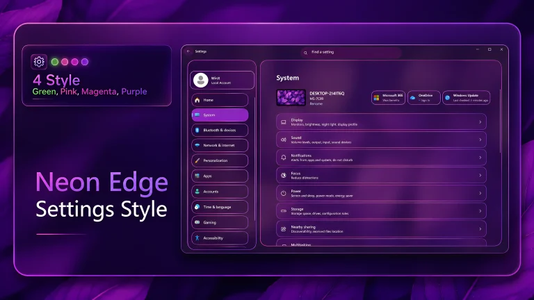
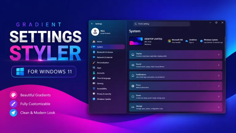
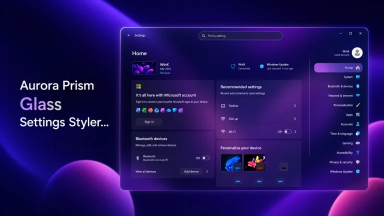
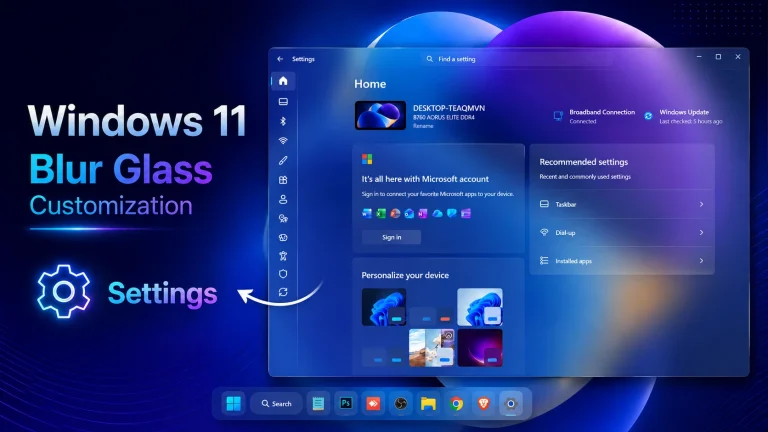
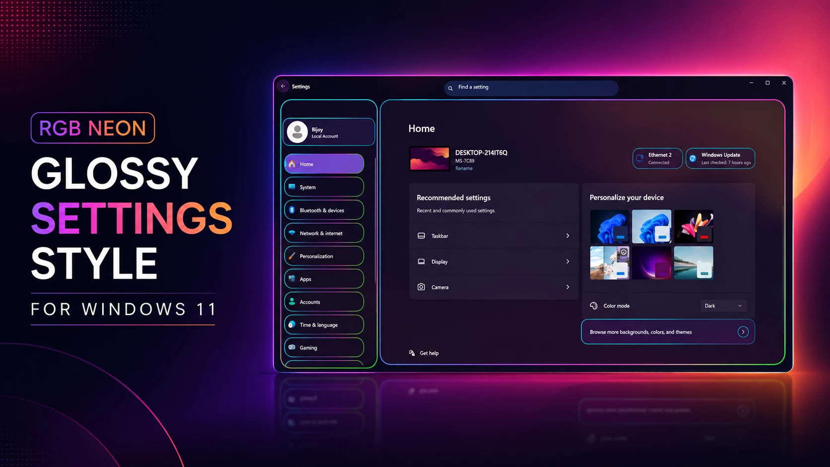
RGB Neon Glossy Settings Style is a modern Windows 11 customization design made for users who enjoy dark UI, colorful neon lighting, and a clean glass-like interface. Inspired by the screenshot preview, this style gives the Windows Settings app a more stylish and futuristic appearance without making the layout feel too crowded.
This Windhawk Settings style is suitable for people who want their Windows 11 desktop to look more personal, gaming-friendly, and visually unique. The combination of purple, pink, blue, and dark glossy panels creates a premium-looking setup while keeping the Settings interface readable and simple.
As with any Windows customization, it is important to apply this style carefully. Always check the file notes, follow the installation guide, and create a system restore point before making visual changes to your system.
What Is RGB Neon Glossy Settings Style?
RGB Neon Glossy Settings Style is a Windows 11 customization style focused on the Settings app interface. It brings a dark glass effect, neon border glow, glossy panels, and RGB-inspired color highlights to create a more modern desktop experience.
The design mood is futuristic, clean, and vibrant. It is especially suitable for users who like RGB setups, gaming desktops, dark mode layouts, neon wallpapers, and glass-style Windows customization. Instead of changing the full operating system, this style mainly focuses on improving the visual appearance of the Windows Settings area through Windhawk-supported customization.
Features
- Dark glossy Settings interface with neon RGB-style color accents.
- Glass-like panels that give Windows 11 a more modern and stylish look.
- Clean sidebar and card-style layout inspired by premium desktop customization.
- Suitable for dark mode users, gaming setups, and neon-themed desktops.
What You Can Customize
With this RGB Neon Glossy Settings Style, users can mainly customize the appearance of the Windows 11 Settings app. Depending on the included files and setup instructions, the style may work together with other desktop customization elements such as wallpapers, icons, cursors, Start Menu appearance, taskbar styling, and File Explorer visual changes.
For the best result, use a matching dark wallpaper with purple, pink, or blue lighting effects. You can also combine it with a clean icon pack and a modern cursor style to create a complete RGB neon desktop setup. However, always apply each customization step carefully and avoid installing tools from unknown or unsafe sources.
Compatibility
This style is designed for Windows 11 customization users, but compatibility can depend on your Windows build, Windhawk version, and the specific Settings Styler configuration included in the download package. Before installing, check the provided file notes and make sure your Windows version supports the required customization method.
Some Windows updates may change the Settings app layout or affect how custom styles work. If you recently updated Windows 11, review the instructions again before applying the style.
Compatibility
- Windows 11 21H2: May work Not tested
- Windows 11 22H2: May work Not Tested
- Windows 11 23H2: Recommended
- Windows 11 24H2: Recommended
- Windows 11 25H2: YES but test carefully after Windows updates
Installation steps:
- Download & Install windhawk.
- install & Open Windows 11 Settings Styler
- Go to the Advanced tab
- Copy the content below and paste it into the text box and click “Save”.
- For more details, visit this GitHub guide
- For more Windhawk Styler, visit Check My Windhawk Category
{ "theme": "Neon Glossy by link vegas", "styleConstants[0]": "OutRadius=30", "styleConstants[1]": "InRadius=20", "styleConstants[2]": "RGBGlossyBorder=<LinearGradientBrush StartPoint=\"0,0\" EndPoint=\"1,1\"><GradientStop Color=\"#00F5FF\" Offset=\"0\"/><GradientStop Color=\"#8B5CF6\" Offset=\"0.35\"/><GradientStop Color=\"#FF2BD6\" Offset=\"0.7\"/><GradientStop Color=\"#39FF14\" Offset=\"1\"/></LinearGradientBrush>", "styleConstants[3]": "RGBSoftBorder=<SolidColorBrush Color=\"#AA00F5FF\" />", "themeResourceVariables[0]": "Accent@Dark=#00F5FF", "themeResourceVariables[1]": "Accent@Light=#FF2BD6", "themeResourceVariables[2]": "ApplicationPageBackgroundThemeBrush@Dark=#00000000", "themeResourceVariables[3]": "ApplicationPageBackgroundThemeBrush@Light=#00000000", "controlStyles[0].target": "SystemSettings.View.RootPage > Grid#RootPageGrid", "controlStyles[0].styles[0]": "Background:=<AcrylicBrush BackgroundSource=\"HostBackdrop\" TintColor=\"#030712\" FallbackColor=\"#F5030712\" TintOpacity=\"0.72\" />", "controlStyles[1].target": "SplitView#RootSplitView", "controlStyles[1].styles[0]": "FlowDirection=LeftToRight","controlStyles[2].target": "SplitView#RootSplitView > Grid > Grid#PaneRoot","controlStyles[2].styles[0]": "HorizontalAlignment=Left","controlStyles[2].styles[1]": "Margin=18,60,-20,0","controlStyles[2].styles[2]": "Width=285","controlStyles[2].styles[3]": "CornerRadius=$OutRadius","controlStyles[2].styles[4]": "Background:=<AcrylicBrush BackgroundSource=\"HostBackdrop\" TintColor=\"#0B1026\" FallbackColor=\"#E60B1026\" TintOpacity=\"0.62\" />","controlStyles[2].styles[5]": "BorderBrush:=$RGBGlossyBorder","controlStyles[2].styles[6]": "BorderThickness=3", "controlStyles[3].target": "SplitView#RootSplitView > Grid > Grid#ContentRoot", "controlStyles[3].styles[0]": "FlowDirection=LeftToRight", "controlStyles[3].styles[1]": "Margin=10,60,20,20", "controlStyles[3].styles[2]": "CornerRadius=$OutRadius", "controlStyles[3].styles[3]": "Background:=<AcrylicBrush BackgroundSource=\"HostBackdrop\" TintColor=\"#101827\" FallbackColor=\"#E6101827\" TintOpacity=\"0.58\" />", "controlStyles[3].styles[4]": "BorderBrush:=$RGBGlossyBorder", "controlStyles[3].styles[5]": "BorderThickness=3", "controlStyles[4].target": "SystemSettings.View.SettingsNavigationViewItem", "controlStyles[4].styles[0]": "MinHeight=54", "controlStyles[4].styles[1]": "Margin=10,4,10,4", "controlStyles[4].styles[2]": "CornerRadius=22", "controlStyles[5].target": "SystemSettings.View.SettingsNavigationViewItem > Grid#NVIRootGrid", "controlStyles[5].styles[0]": "Margin=0,0,16,0", "controlStyles[6].target": "SystemSettings.View.SettingsNavigationViewItem > Grid#NVIRootGrid > Microsoft.UI.Xaml.Controls.Primitives.NavigationViewItemPresenter#NavigationViewItemPresenter > Grid#LayoutRoot@PointerStates", "controlStyles[6].styles[0]": "CornerRadius=22", "controlStyles[6].styles[1]": "HorizontalAlignment=Stretch", "controlStyles[6].styles[2]": "Margin=0,0,12,0", "controlStyles[6].styles[3]": "Background@Normal:=<SolidColorBrush Color=\"#00000000\"/>", "controlStyles[6].styles[4]": "Background@PointerOver:=<AcrylicBrush BackgroundSource=\"HostBackdrop\" TintColor=\"#00F5FF\" FallbackColor=\"#5500F5FF\" TintOpacity=\"0.42\" />", "controlStyles[6].styles[5]": "Background@Selected:=<AcrylicBrush BackgroundSource=\"HostBackdrop\" TintColor=\"#8B5CF6\" FallbackColor=\"#AA8B5CF6\" TintOpacity=\"0.82\" />", "controlStyles[6].styles[6]": "BorderBrush:=$RGBGlossyBorder", "controlStyles[6].styles[7]": "BorderThickness=2", "controlStyles[7].target": "TextBox#CommandSearchTextBox", "controlStyles[7].styles[0]": "Height=48", "controlStyles[7].styles[1]": "CornerRadius=24", "controlStyles[7].styles[2]": "Margin=6,0,14,0", "controlStyles[7].styles[3]": "Background:=<AcrylicBrush BackgroundSource=\"HostBackdrop\" TintColor=\"#172554\" FallbackColor=\"#E6172554\" TintOpacity=\"0.85\" />", "controlStyles[7].styles[4]": "BorderBrush:=$RGBGlossyBorder", "controlStyles[7].styles[5]": "BorderThickness=3", "controlStyles[8].target": "Button", "controlStyles[8].styles[0]": "CornerRadius=18", "controlStyles[8].styles[1]": "Background:=<AcrylicBrush BackgroundSource=\"HostBackdrop\" TintColor=\"#1E1B4B\" FallbackColor=\"#DD1E1B4B\" TintOpacity=\"0.7\" />", "controlStyles[8].styles[2]": "BorderBrush:=$RGBSoftBorder", "controlStyles[8].styles[3]": "BorderThickness=2", "controlStyles[9].target": "ComboBox", "controlStyles[9].styles[0]": "CornerRadius=18", "controlStyles[9].styles[1]": "BorderBrush:=$RGBSoftBorder", "controlStyles[9].styles[2]": "BorderThickness=2", "controlStyles[10].target": "ToggleSwitch", "controlStyles[10].styles[0]": "CornerRadius=18"}Final Thoughts
The RGB Neon Glossy Settings Style For Windows 11 is a stylish choice for users who want a brighter, more modern desktop experience. Its dark base, colorful neon outlines, and glossy finish can make the Settings area look much more unique while still feeling clean and organized.
If you plan to try it, remember the basics first: create a restore point, follow setup instructions carefully, and make changes gradually. That simple approach helps you enjoy customization more safely and with fewer problems.
For Windows 11 users who love personalizing their setup, this style is a strong option worth exploring.