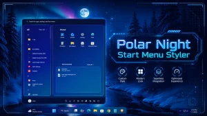
New Polar Night Start Menu & Taskbar Style
Polar Night Start Menu & Taskbar Style with Windhawk : Use Windhawk to create a Polar Night Start Menu and taskbar style on Windows 11 with setup steps, benefits, customization tips, and troubleshooting.

Polar Night Start Menu & Taskbar Style with Windhawk
Windhawk gives Windows 11 users a flexible way to customize interface elements that are difficult to change through the standard Personalization settings. For users who enjoy dark des a Polar Night-inspired style can create a cleaner and more coordinated appearance.
This setup combines deep blue-gray tones, subtle borders, rounded elements, and controlled transparency. The goal is not to change how Windows works, but to give the Start Menu and taskbar a consistent visual identity that complements dark wallpapers, icon packs, and desktop widgets.
What Is the Polar Night Start Menu and Taskbar Style?
Polar Night is a dark color group associated with the Nord color palette. It uses cool shades such as charcoal, slate blue, and muted gray to produce a calm interface with readable contrast.
In this setup, Polar Night refers to a user-created visual configuration rather than an official Microsoft or Windhawk product. The appearance can be applied through the Windows 11 Start Menu Styler and Windows 11 Taskbar Styler mods available from the official Windhawk platform.
The final design depends on the style settings or configuration supplied by the theme creator. Different releases may use different spacing, colors, corner radiuses, borders, or transparency effects.
How Windhawk Supports This Customization
Windhawk is a Windows customization platform that allows users to install and manage community-created mods. Each mod has its own details, settings, source code, and update information.
The Polar Night setup commonly relies on two separate mods:
- Windows 11 Start Menu Styler: Used to customize supported visual elements inside the Start Menu and Windows Search interface.
- Windows 11 Taskbar Styler: Used to change supported taskbar elements through contributed themes or custom style settings.
Because the Start Menu and taskbar are handled separately, users can apply both styles together or customize only one part of the interface.
Main Features of the Polar Night Style
- Dark blue-gray palette: Cool tones create a softer alternative to a completely black desktop.
- Coordinated interface: The Start Menu and taskbar can share similar backgrounds, borders, and accent colors.
- Minimal appearance: Carefully adjusted spacing and restrained effects can reduce unnecessary visual clutter.
- Flexible configuration: Individual style values can be changed when the supplied theme supports manual editing.
- Easy mod control: Installed mods can be enabled, disabled, configured, or removed through Windhawk.
- Dark wallpaper compatibility: The style works naturally with dark, winter, space, and night-themed backgrounds.
- Modern Windows 11 inspired design
- Clean and minimal Start Menu layout
- Beautiful purple, blue, and glass effect
- Perfect for aesthetic desktop setups
- Works great with Windhawk customization
- Lightweight visual style for daily use
- 21H2 Yes
- 22H2 Yes
- 22H3 Yes
- 24H2 Yes
- 25H2 Yes
- Download and install Windhawk
- Open Windhawk and install the Windows 11 Start Menu Styler mod
- Go to the Advanced tab
- Paste the provided configuration code into the “Mod settings” box
- Click Save to apply the style
- For more details, visit this GitHub guide
theme: Polar Night Start Menu Style by WinX CustomizationdisableNewStartMenuLayout: newLayoutSideBySidestyleConstants: - NeonBg=<WindhawkBlur BlurAmount="28" TintColor="#B0051238" TintOpacity="0.86" TintLuminosityOpacity="0.18" FallbackColor="#051238"/> - NeonBg2=<LinearGradientBrush StartPoint="0,0" EndPoint="1,1"><GradientStop Color="#EEB72BFF" Offset="0.0"/><GradientStop Color="#D8143CFF" Offset="0.42"/><GradientStop Color="#D900D9FF" Offset="0.72"/><GradientStop Color="#D900F0FF" Offset="1.0"/></LinearGradientBrush> - NeonCard=<LinearGradientBrush StartPoint="0,0" EndPoint="1,1"><GradientStop Color="#551B0B7A" Offset="0.0"/><GradientStop Color="#551133EE" Offset="0.50"/><GradientStop Color="#5514D8FF" Offset="1.0"/></LinearGradientBrush> - NeonLeft=<LinearGradientBrush StartPoint="0,0" EndPoint="1,1"><GradientStop Color="#881E006B" Offset="0.0"/><GradientStop Color="#660014D8" Offset="0.55"/><GradientStop Color="#5520E6FF" Offset="1.0"/></LinearGradientBrush> - NeonRight=<LinearGradientBrush StartPoint="0,0" EndPoint="1,1"><GradientStop Color="#77030C45" Offset="0.0"/><GradientStop Color="#661051EE" Offset="0.55"/><GradientStop Color="#5511B8FF" Offset="1.0"/></LinearGradientBrush> - NeonBorder=<LinearGradientBrush StartPoint="0,0" EndPoint="1,1"><GradientStop Color="#FFFF65F2" Offset="0.0"/><GradientStop Color="#FF7B55FF" Offset="0.36"/><GradientStop Color="#FF00E5FF" Offset="0.72"/><GradientStop Color="#FF66FFF0" Offset="1.0"/></LinearGradientBrush> - NeonHover=<SolidColorBrush Color="#5536E8FF"/> - NeonPress=<SolidColorBrush Color="#664D2BFF"/> - NeonText=<SolidColorBrush Color="#F1FCFF"/> - NeonTextDim=<SolidColorBrush Color="#B7C9FF"/> - NeonRadius=28 - NeonCardRadius=18 - NeonBorderThickness=1.4controlStyles: - target: Grid styles: - RequestedTheme=2 - target: StartDocked.StartSizingFrame styles: - MinWidth=920 - MaxWidth=920 - Width=920 - target: StartDocked.LauncherFrame > Grid#RootGrid styles: - MinWidth=920 - MaxWidth=920 - target: StartDocked.LauncherFrame > Grid#RootPanel > Grid#RootGrid styles: - MinWidth=920 - MaxWidth=920 - target: Border#AcrylicBorder styles: - Background:=$NeonBg - BorderBrush:=$NeonBorder - BorderThickness=$NeonBorderThickness - CornerRadius=$NeonRadius - target: Border#AcrylicOverlay styles: - Background:=$NeonBg2 - Opacity=0.22 - CornerRadius=$NeonRadius - target: Border#LayerBorder styles: - Background:=$NeonBg - BorderBrush:=$NeonBorder - BorderThickness=$NeonBorderThickness - CornerRadius=$NeonRadius - target: Border#DropShadowDismissTarget styles: - Background:=$NeonBg - BorderBrush:=$NeonBorder - BorderThickness=$NeonBorderThickness - CornerRadius=$NeonRadius - Padding=0 - Margin=0 - target: StartDocked.SearchBoxToggleButton#StartMenuSearchBox styles: - Height=48 - Margin=24,18,24,12 - target: StartDocked.SearchBoxToggleButton#StartMenuSearchBox > Grid > Border#BorderElement styles: - Background:=$NeonCard - BorderBrush:=$NeonBorder - BorderThickness=1 - CornerRadius=18 - target: StartDocked.SearchBoxToggleButton#StartMenuSearchBox > Grid > ContentPresenter#ContentPresenter > TextBlock#PlaceholderText styles: - Foreground:=$NeonTextDim - Text=Search apps, files, settings - target: Grid#SideBySidePinnedWrapper styles: - ColumnDefinitions:=<ColumnDefinitionCollection><ColumnDefinition Width="330*"/><ColumnDefinition Width="590*"/></ColumnDefinitionCollection> - target: GridView#AllAppsGrid > Border > Grid#SideBySidePinnedWrapper > ScrollViewer#ScrollViewer styles: - Grid.Column=0 - Background:=$NeonLeft - BorderBrush:=$NeonBorder - BorderThickness=1 - CornerRadius=$NeonCardRadius - Margin=18,0,8,18 - Padding=6,6,6,6 - target: ScrollViewer#SideBySidePinnedScrollViewer styles: - Grid.Column=1 - Background:=$NeonRight - BorderBrush:=$NeonBorder - BorderThickness=1 - CornerRadius=$NeonCardRadius - Margin=8,0,18,18 - Padding=10,8,10,8 - target: Grid#SideBySidePinnedWrapper > ScrollViewer > Border#Root > Grid > ScrollContentPresenter > ItemsPresenter > ItemsWrapGrid styles: - Margin=24,4,24,12 - target: Grid#AllListHeading > TextBlock#AllListHeadingText styles: - Foreground:=$NeonText - FontSize=18 - FontWeight=SemiBold - Margin=28,8,12,8 - target: Grid#AllListHeading > Microsoft.UI.Xaml.Controls.DropDownButton#ViewSelectionButton styles: - Margin=0,0,24,0 - Foreground:=$NeonText - target: Grid#TopLevelSuggestionsContainer styles: - Margin=22,0,22,0 - Background:=<SolidColorBrush Color="#2200E5FF"/> - BorderBrush:=$NeonBorder - BorderThickness=0.8 - CornerRadius=16 - target: Grid#TopLevelSuggestionsListHeader styles: - Margin=22,4,22,4 - target: TextBlock#PinnedListHeaderText styles: - Foreground:=$NeonText - FontSize=18 - FontWeight=SemiBold - target: TextBlock#MoreSuggestionsListHeaderText styles: - Foreground:=$NeonText - FontSize=17 - FontWeight=SemiBold - target: Windows.UI.Xaml.Controls.Grid#AllAppsRoot styles: - Visibility=Visible - Width=330 - MinHeight=610 - Background:=$NeonLeft - BorderBrush:=$NeonBorder - BorderThickness=1 - CornerRadius=$NeonCardRadius - RenderTransform:=<TranslateTransform X="-300"/> - Padding=6,6,6,6 - target: Windows.UI.Xaml.Controls.Grid#UndockedRoot styles: - Visibility=Visible - Width=590 - MinHeight=610 - Margin=300,0,0,0 - Background:=$NeonRight - BorderBrush:=$NeonBorder - BorderThickness=1 - CornerRadius=$NeonCardRadius - Padding=8,8,8,8 - target: Windows.UI.Xaml.Controls.Button#CloseAllAppsButton styles: - Visibility=Collapsed - target: Windows.UI.Xaml.Controls.Button#ShowAllAppsButton styles: - Visibility=Collapsed - target: StartMenu.PinnedList#StartMenuPinnedList styles: - Margin=4,0,4,0 - Height=310 - target: Windows.UI.Xaml.Controls.Grid#TopLevelSuggestionsContainer styles: - Margin=22,-4,22,-24 - Height=260 - target: Windows.UI.Xaml.Controls.Grid#ShowMoreSuggestions styles: - Visibility=Visible - Margin=0,8,22,0 - target: Windows.UI.Xaml.Controls.GridViewItem > Border#ContentBorder@CommonStates styles: - Background@PointerOver:=$NeonHover - Background@Pressed:=$NeonPress - BorderBrush@PointerOver:=$NeonBorder - BorderThickness@PointerOver=1 - CornerRadius=16 - Margin=2 - target: Windows.UI.Xaml.Controls.GridViewItem > Border > Grid > Border#BackgroundBorder styles: - CornerRadius=16 - Background@PointerOver:=$NeonHover - Background@Pressed:=$NeonPress - target: StartDocked.AppListViewItem > Grid > Border#BackgroundBorder styles: - CornerRadius=14 - Background@PointerOver:=$NeonHover - Background@Pressed:=$NeonPress - target: StartDocked.AllAppsGridListView#AppsList styles: - Padding=20,4,10,14 - target: StartDocked.AllAppsGridListView > ScrollViewer > Border > Grid > ScrollContentPresenter styles: - Margin=0,0,4,0 - target: TextBlock styles: - Foreground:=$NeonText - target: Button styles: - Foreground:=$NeonText - target: StartDocked.NavigationPaneView#NavigationPane styles: - Background:=<SolidColorBrush Color="#2200E5FF"/> - BorderBrush:=$NeonBorder - BorderThickness=0.8 - CornerRadius=18 - Margin=24,0,24,18 - target: StartDocked.UserTileView styles: - Foreground:=$NeonText - target: StartDocked.PowerOptionsView#PowerButton styles: - Foreground:=$NeonText - Background:=<SolidColorBrush Color="#3314D8FF"/> - BorderBrush:=$NeonBorder - BorderThickness=1 - CornerRadius=14 - target: ScrollBar styles: - MinWidth=5 - Opacity=0.75 - target: Thumb styles: - Background:=<SolidColorBrush Color="#AA00E5FF"/> - CornerRadius=8 - target: Windows.UI.Xaml.Controls.SemanticZoom#ZoomControl styles: - IsZoomOutButtonEnabled=True - target: Windows.UI.Xaml.Controls.Button#ZoomOutButton styles: - Width=30 - Height=30 - FontSize=16 - CornerRadius=10 - Background:=<SolidColorBrush Color="#4414D8FF"/> - BorderBrush:=$NeonBorder - BorderThickness=1 - target: Windows.UI.Xaml.Controls.Button#ZoomOutButton > Windows.UI.Xaml.Controls.ContentPresenter#ContentPresenter > Windows.UI.Xaml.Controls.TextBlock styles: - Text= - Foreground:=$NeonTextthemeResourceVariables: - ''webContentStyles: - target: '' styles: - ''webContentCustomJs: ''Taskbar Style
theme: Polar Night Taskbar Style by WinX CustomizationstyleConstants: - ''controlStyles: - target: Taskbar.TaskbarFrame styles: - Width=Auto - HorizontalAlignment=Center - Margin=220,0,220,0 - target: Taskbar.TaskbarFrame > Grid#RootGrid styles: - Background:=<LinearGradientBrush StartPoint="0,0" EndPoint="1,1"><GradientStop Color="#E4071038" Offset="0"/><GradientStop Color="#D5111970" Offset="0.45"/><GradientStop Color="#C20A7E9E" Offset="1"/></LinearGradientBrush> - Padding=8,0,8,0 - CornerRadius=18 - BorderThickness=1 - BorderBrush:=<LinearGradientBrush StartPoint="0,0" EndPoint="1,0"><GradientStop Color="#FFFF2DFF" Offset="0"/><GradientStop Color="#FF00E5FF" Offset="0.5"/><GradientStop Color="#FF3B82F6" Offset="1"/></LinearGradientBrush> - target: Taskbar.TaskbarFrame > Grid#RootGrid > Taskbar.TaskbarBackground > Grid > Rectangle#BackgroundFill styles: - Visibility=Collapsed - target: Rectangle#BackgroundStroke styles: - Visibility=Collapsed - target: Taskbar.ExperienceToggleButton styles: - CornerRadius=12 - Margin=2,4,2,4 - target: Taskbar.SearchBoxButton styles: - CornerRadius=12 - Margin=2,4,2,4 - target: Taskbar.TaskListButton styles: - CornerRadius=12 - Margin=2,4,2,4 - target: Taskbar.TaskListLabeledButtonPanel@RunningIndicatorStates > Rectangle#RunningIndicator styles: - Fill=#FF00E5FF - Height=3 - Width=18 - RadiusX=2 - RadiusY=2 - Fill@ActiveRunningIndicator=#FFFF2DFF - Width@ActiveRunningIndicator=26 - target: Grid#SystemTrayFrameGrid styles: - Background:=<LinearGradientBrush StartPoint="0,0" EndPoint="1,1"><GradientStop Color="#E4071038" Offset="0"/><GradientStop Color="#D5111970" Offset="0.45"/><GradientStop Color="#C20A7E9E" Offset="1"/></LinearGradientBrush> - Margin=8,0,8,8 - Padding=6,0,6,0 - CornerRadius=18 - BorderThickness=1 - BorderBrush:=<LinearGradientBrush StartPoint="0,0" EndPoint="1,0"><GradientStop Color="#FFFF2DFF" Offset="0"/><GradientStop Color="#FF00E5FF" Offset="0.6"/><GradientStop Color="#FF3B82F6" Offset="1"/></LinearGradientBrush> - target: SystemTray.NotifyIconView#NotifyItemIcon styles: - MinWidth=30 - Padding=0 - target: SystemTray.ImageIconContent > Grid#ContainerGrid styles: - Padding=3,0,3,0 - target: SystemTray.TextIconContent > Grid#ContainerGrid styles: - Padding=3,0,3,0 - target: SystemTray.ChevronIconView styles: - MinWidth=28 - Padding=0 - target: SystemTray.OmniButton styles: - Padding=0 - target: Border#OverflowFlyoutBackgroundBorder styles: - Background:=<AcrylicBrush TintColor="#071038" TintOpacity="0.88" FallbackColor="#071038" /> - CornerRadius=18 - BorderThickness=1 - BorderBrush:=<SolidColorBrush Color="#FF00E5FF" /> - target: Taskbar.TaskbarBackground#HoverFlyoutBackgroundControl > Grid > Rectangle#BackgroundFill styles: - Fill:=<AcrylicBrush TintColor="#071038" TintOpacity="0.88" FallbackColor="#071038" />themeResourceVariables: - ''xamlDiagnosticsHandling: ''Required Windhawk Mods Taskbar Hight & Icon Size for similar results
To achieve similar results, install and configure the following Windhawk mods in addition to Taskbar Styler
- Install and open the Taskbar height and icon size mod in Windhawk.
- Go to the Settings tab and select Textual mode.
- Copy the content below and paste it into the text box.
- Click Save settings to apply the Taskbar Style.
TaskbarHeight: 56IconSize: 25TaskbarButtonWidth: 44IconSizeSmall: 20TaskbarButtonWidthSmall: 36Notification Center Style

- Install and open the Windows 11 Notification Center Styler mod in Windhawk.
- Go to the Settings tab and select Textual mode.
- Copy the content below and paste it into the text box.
- Click Save settings to apply the Style.
theme: Polar Night Notification Center Style by WinX CustomizationstyleConstants: - ''controlStyles: - target: Grid#NotificationCenterGrid styles: - Background:=<LinearGradientBrush StartPoint="0,0" EndPoint="1,1"><GradientStop Color="#FF071038" Offset="0"/><GradientStop Color="#FF111970" Offset="0.55"/><GradientStop Color="#FF0A7E9E" Offset="1"/></LinearGradientBrush> - BorderBrush:=<LinearGradientBrush StartPoint="0,0" EndPoint="1,0"><GradientStop Color="#FFFF2DFF" Offset="0"/><GradientStop Color="#FF00E5FF" Offset="0.55"/><GradientStop Color="#FF3B82F6" Offset="1"/></LinearGradientBrush> - BorderThickness=1 - CornerRadius=18 - Margin=0,0,0,0 - Shadow:= - target: ScrollViewer#ListContent styles: - Background=Transparent - target: ActionCenter.FlexibleToastView#FlexibleNormalToastView styles: - Background=Transparent - target: Border#ToastBackgroundBorder2 styles: - Background:=<LinearGradientBrush StartPoint="0,0" EndPoint="1,1"><GradientStop Color="#EE111970" Offset="0"/><GradientStop Color="#DD0A7E9E" Offset="1"/></LinearGradientBrush> - BorderBrush=#6600E5FF - BorderThickness=1 - CornerRadius=16 - target: ActionCenter.FlexibleItemView styles: - CornerRadius=16 - target: Button#ClearAll styles: - Background=#66111970 - Foreground=#FFFFFFFF - BorderBrush=#FF00E5FF - BorderThickness=1 - CornerRadius=12 - AccessKey=x - target: ActionCenter.FocusSessionControl styles: - Height=0 - target: ActionCenter.FocusSessionControl#FocusSessionControl > Grid#FocusGrid styles: - Background=Transparent - BorderThickness=0 - target: Grid#CalendarCenterGrid styles: - Background:=<LinearGradientBrush StartPoint="0,0" EndPoint="1,1"><GradientStop Color="#FF071038" Offset="0"/><GradientStop Color="#FF111970" Offset="0.55"/><GradientStop Color="#FF0A7E9E" Offset="1"/></LinearGradientBrush> - BorderBrush:=<LinearGradientBrush StartPoint="0,0" EndPoint="1,0"><GradientStop Color="#FFFF2DFF" Offset="0"/><GradientStop Color="#FF00E5FF" Offset="0.55"/><GradientStop Color="#FF3B82F6" Offset="1"/></LinearGradientBrush> - BorderThickness=1 - CornerRadius=18 - Margin=0,0,8,8 - Shadow:= - target: ScrollViewer#CalendarControlScrollViewer styles: - Background=Transparent - BorderThickness=0 - target: Border#CalendarHeaderMinimizedOverlay styles: - Background=Transparent - BorderThickness=0 - target: Button#ExpandCollapseButton styles: - Background=#66111970 - Foreground=#FFFFFFFF - BorderBrush=#FF00E5FF - BorderThickness=1 - CornerRadius=12 - AccessKey=e - target: CalendarViewDayItem styles: - CornerRadius=12 - BorderThickness=1 - BorderBrush=#3300E5FF - target: CalendarViewDayItem > Border styles: - CornerRadius=12 - target: Control > Border styles: - CornerRadius=12 - target: Grid#ControlCenterRegion styles: - Background:=<LinearGradientBrush StartPoint="0,0" EndPoint="1,1"><GradientStop Color="#FF071038" Offset="0"/><GradientStop Color="#FF111970" Offset="0.55"/><GradientStop Color="#FF0A7E9E" Offset="1"/></LinearGradientBrush> - BorderBrush:=<LinearGradientBrush StartPoint="0,0" EndPoint="1,0"><GradientStop Color="#FFFF2DFF" Offset="0"/><GradientStop Color="#FF00E5FF" Offset="0.55"/><GradientStop Color="#FF3B82F6" Offset="1"/></LinearGradientBrush> - BorderThickness=1 - CornerRadius=18 - Margin=0,0,8,8 - Shadow:= - target: Grid#L1Grid > Border styles: - Background=Transparent - BorderThickness=0 - target: ContentPresenter#PageContent styles: - Background=Transparent - target: ContentPresenter#PageContent > Grid > Border styles: - Background=Transparent - target: ContentControl#QuickActionContentControl > ContentPresenter > Grid > ToggleButton styles: - Background=#66111970 - BorderBrush=#5500E5FF - BorderThickness=1 - CornerRadius=14 - target: ContentControl#QuickActionContentControl > ContentPresenter > Grid > Button styles: - Background=#66111970 - BorderBrush=#5500E5FF - BorderThickness=1 - CornerRadius=14 - target: ControlCenter.PaginatedToggleButton#ToggleButton styles: - Background=#66111970 - BorderBrush=#5500E5FF - BorderThickness=1 - CornerRadius=14 - target: ControlCenter.PaginatedToggleButton#SplitL2Button styles: - Background=#66111970 - BorderBrush=#5500E5FF - BorderThickness=1 - CornerRadius=14 - target: Microsoft.UI.Xaml.Controls.PipsPager#QuickActionsPager styles: - Visibility=Collapsed - target: Grid#FooterGrid styles: - Background=Transparent - BorderThickness=0 - target: ControlCenter.AsyncSlider styles: - Margin=12,0,12,0 - target: Windows.UI.Xaml.Controls.Primitives.Thumb#HorizontalThumb styles: - Background=#FF00E5FF - target: Rectangle#HorizontalTrackRect styles: - Fill=#66111970 - RadiusX=6 - RadiusY=6 - target: Rectangle#HorizontalDecreaseRect styles: - Fill=#FF00E5FF - RadiusX=6 - RadiusY=6 - target: Grid#MediaTransportControlsRegion styles: - Background:=<LinearGradientBrush StartPoint="0,0" EndPoint="1,1"><GradientStop Color="#EE111970" Offset="0"/><GradientStop Color="#DD0A7E9E" Offset="1"/></LinearGradientBrush> - BorderBrush=#6600E5FF - BorderThickness=1 - CornerRadius=18 - Shadow:= - target: Grid#MediaTransportControlsRoot styles: - Background=Transparent - target: Grid#ThumbnailImage styles: - Width=72 - Height=72 - CornerRadius=14 - target: Grid#ThumbnailImage > Border styles: - CornerRadius=14 - target: Button#PlayPauseButton > ContentPresenter#ContentPresenter styles: - Background=#66111970 - BorderBrush=#FF00E5FF - BorderThickness=1 - CornerRadius=12 - target: Windows.UI.Xaml.Controls.Primitives.RepeatButton#NextButton > ContentPresenter#ContentPresenter styles: - Background=#33111970 - BorderBrush=#5500E5FF - BorderThickness=1 - CornerRadius=10 - target: Windows.UI.Xaml.Controls.Primitives.RepeatButton#PreviousButton > ContentPresenter#ContentPresenter styles: - Background=#33111970 - BorderBrush=#5500E5FF - BorderThickness=1 - CornerRadius=10 - target: MenuFlyoutPresenter > Border styles: - Background:=<LinearGradientBrush StartPoint="0,0" EndPoint="1,1"><GradientStop Color="#FF071038" Offset="0"/><GradientStop Color="#FF111970" Offset="1"/></LinearGradientBrush> - BorderBrush:=<LinearGradientBrush StartPoint="0,0" EndPoint="1,0"><GradientStop Color="#FFFF2DFF" Offset="0"/><GradientStop Color="#FF00E5FF" Offset="1"/></LinearGradientBrush> - BorderThickness=1 - CornerRadius=16 - Padding=2,4,2,4 - target: Border#JumpListRestyledAcrylic styles: - Background=#FF071038 - BorderBrush=#FF00E5FF - BorderThickness=1 - CornerRadius=16 - Margin=-2,-2,-2,-2 - target: JumpViewUI.SystemItemListViewItem > Grid#LayoutRoot > Border#BackgroundBorder styles: - Background=Transparent - CornerRadius=12 - target: JumpViewUI.JumpListListViewItem > Grid#LayoutRoot > Border#BackgroundBorder styles: - CornerRadius=12themeResourceVariables: - ''Final Thoughts
A Polar Night Start Menu and taskbar setup can give Windows 11 a refined dark appearance without covering the desktop in distracting visual effects. With Windhawk, users can manage the two interface styles separately and adjust the setup according to their display, wallpaper, and usability preferences.
Use official mod pages, follow the configuration creator’s instructions, and test each change carefully. The best desktop theme is one that looks consistent while keeping every important control clear and functional.


