

ColorFlux Notification Center Style For Windows 11
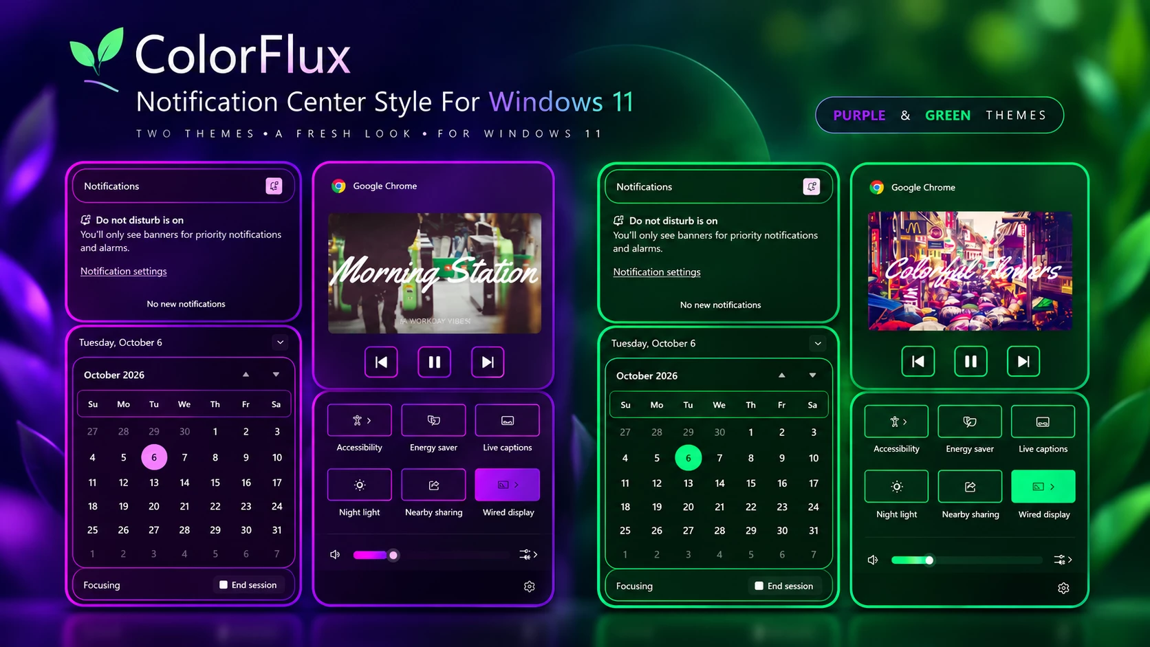
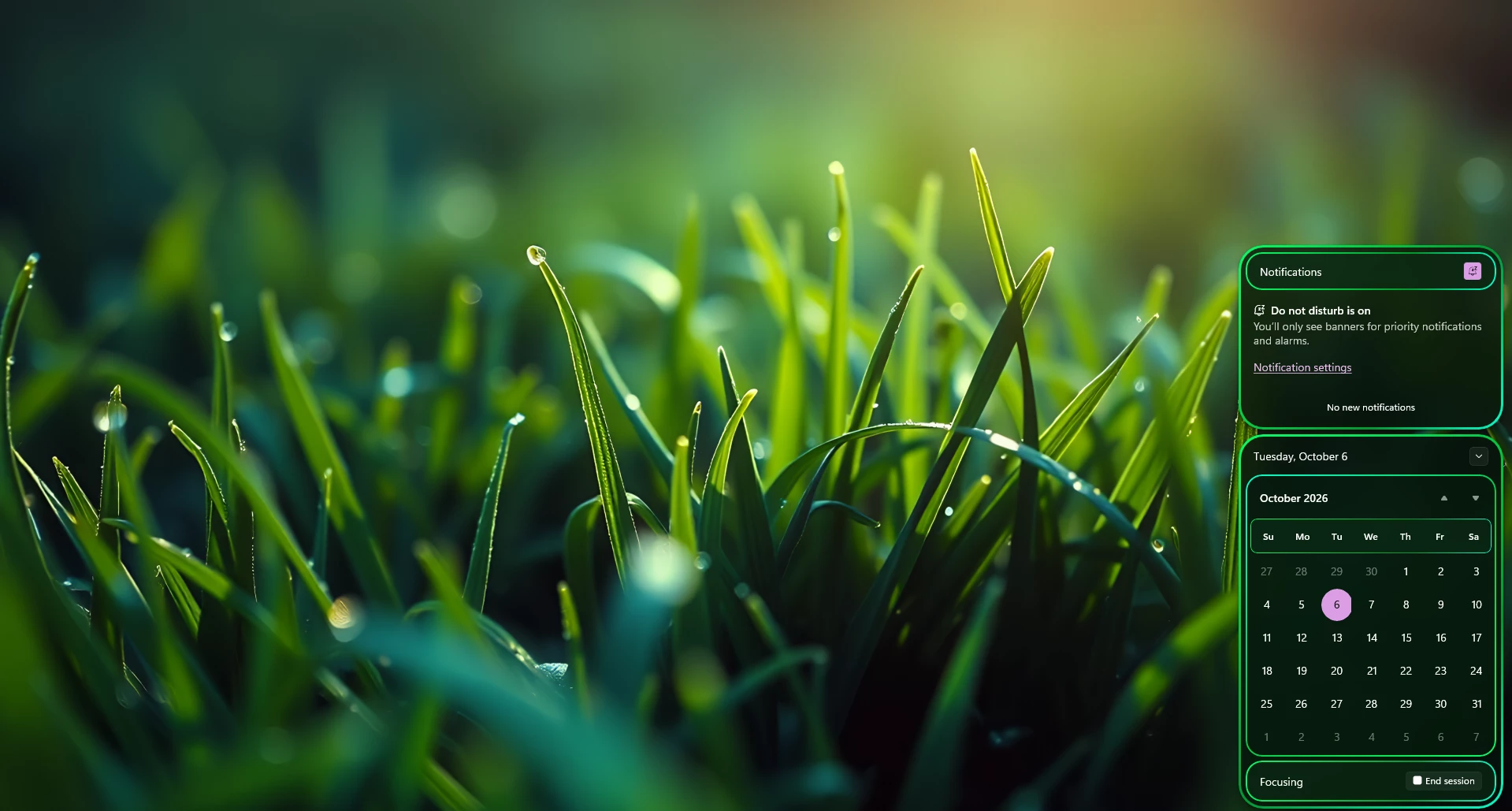
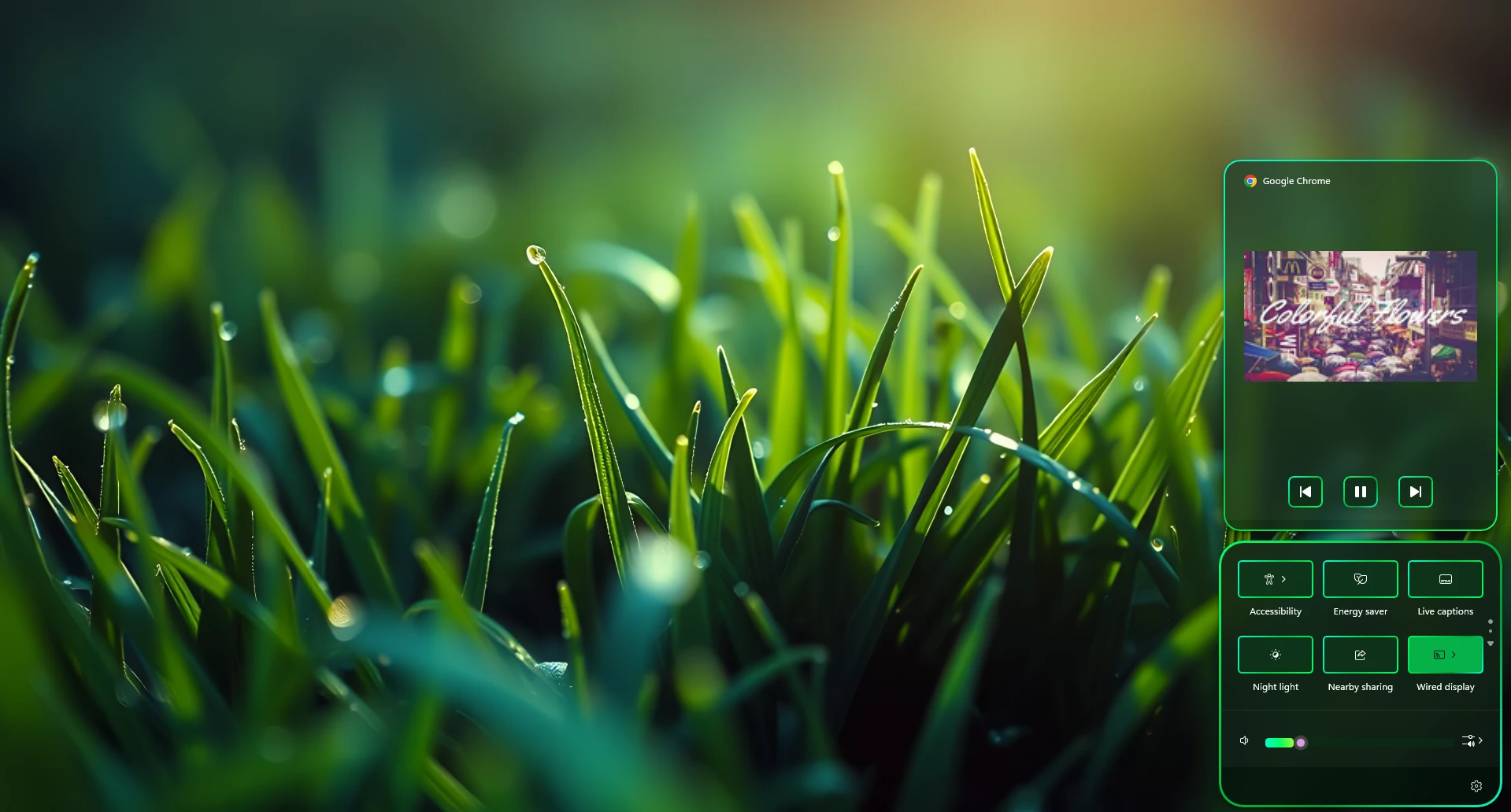
ColorFlux Notification Center Style For Windows 11 : ColorFlux Notification Center Style gives the Windows 11 Notification Center and Quick Settings area a colorful outlined design using Windhawk. Choose between Purple and Green variants while keeping the familiar Windows layout and controls.

ColorFlux Notification Center Style For Windows 11
ColorFlux Notification Center Style For Windows 11 gives the Notification Center and Quick Settings area a more colorful identity without completely changing the familiar Windows 11 layout. Created for use with Windhawk, the style focuses on clean dark panels, rounded corners, and carefully placed colored outlines.
ColorFlux comes with two visual variants: Purple and Green. Both use the same overall design language, so you can simply choose the version that works better with your wallpaper, desktop colors, or personal setup.
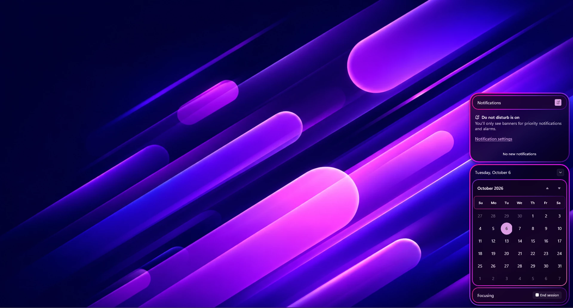
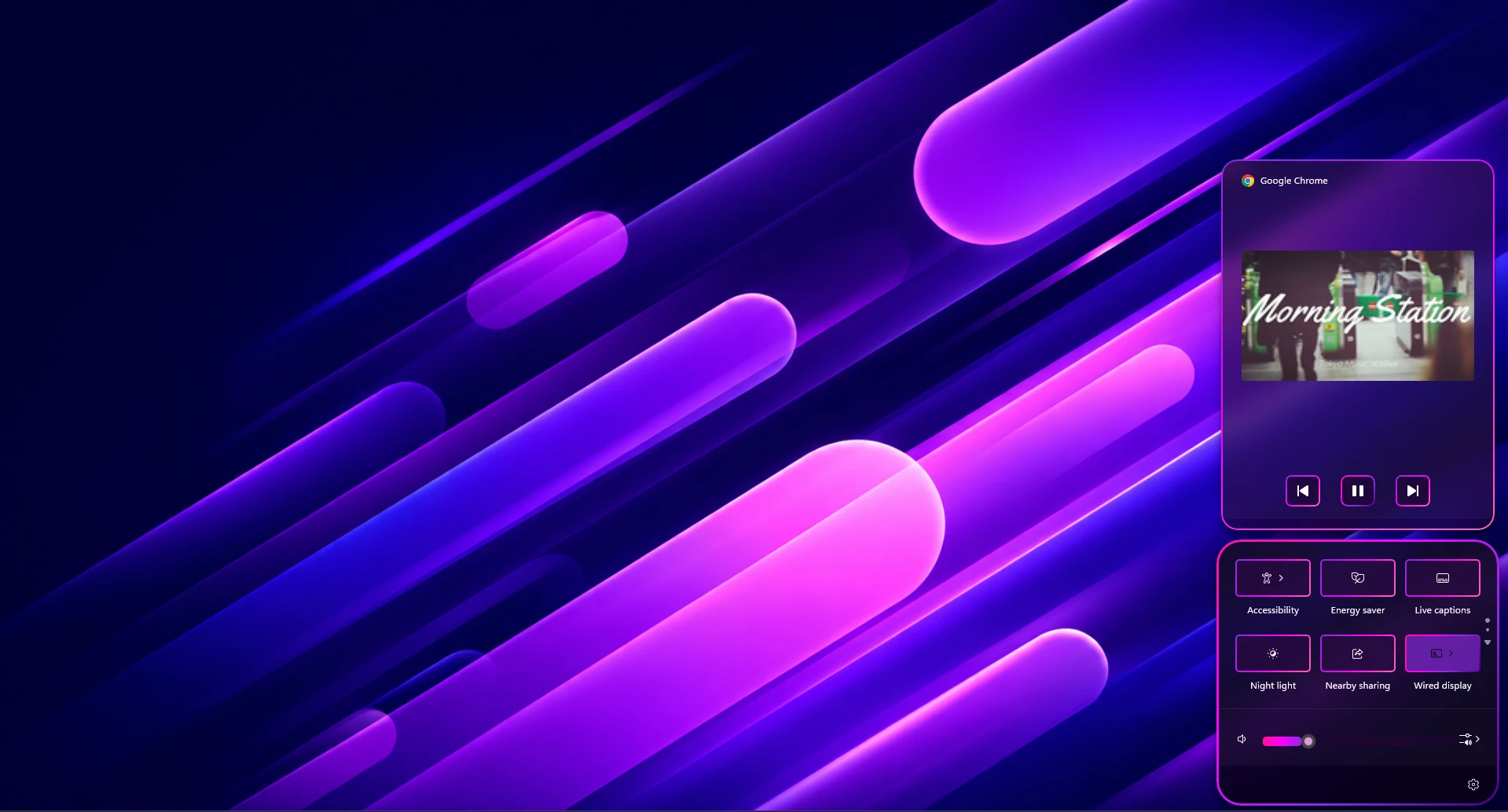
The Purple version uses bright pink and purple accents around the panels and individual controls. The Green version switches the main accent to a vivid green tone while keeping a subtle contrasting color in selected elements. This makes the two versions feel related without looking identical.
Two Color Styles to Choose From
One of the main ideas behind ColorFlux is giving you a choice instead of locking the design to a single accent color.
- ColorFlux Purple: Uses purple and magenta-style outlines with a dark purple-toned panel background.
- ColorFlux Green: Uses bright green outlines with a dark green-toned background and a few softer contrasting accents.
The overall layout remains consistent between both versions. You can switch between them depending on the wallpaper or Windows setup you’re currently using.
Colorful Outlined Notification Center
The most noticeable change is the border treatment. ColorFlux adds a clear colored outline around the main Notification Center sections instead of leaving the panels visually flat.
The notification area, calendar section, media controls, and Quick Settings panel all follow the same rounded design language. Smaller sections inside these panels also receive matching outlines, which helps the interface feel more structured.
The border color is bright enough to separate each section from the background. This keeps text, icons, calendar dates, and controls easy to read.
Designed for Dark Desktop Setups
ColorFlux works especially well with darker wallpapers because the bright border accents have enough contrast to stand out against the desktop.
The Purple variant pairs naturally with violet, blue, pink, and other darker abstract wallpapers. The Green variant works particularly well with green, black, nature-inspired, and darker neutral backgrounds.
You don’t need to use a specific wallpaper, though. The choice mainly comes down to which ColorFlux variant fits your desktop better.
Key Features
- Two color variants: Purple and Green.
- Colorful outlined Notification Center panels.
- Matching Calendar and Focus section styling.
- Customized Quick Settings and media controls.
- Rounded dark panels with clean accent borders.
- Designed for use with Windhawk on Windows 11.
Windows will work the same as before. ColorFlux mainly changes the look and colors of these areas. It does not completely change how Windows works.
Compatibility
- Windows 11 21H2: Not Tested
- Windows 11 22H2: Not Tested
- Windows 11 23H2: Not Tested
- Windows 11 24H2: Not Tested
- Windows 11 25H2: YES
- Tested On Windows 11 26H2: BUILD 26300.9457.
Before Installing the Style
Before applying any Windows customization, it’s a good idea to create a System Restore Point. Windhawk modifications can interact with Windows interface components, and Windows updates may occasionally change how a mod behaves.
Also make sure Windhawk and the required Notification Center styling mod are up to date before using the configuration.
If the style doesn’t appear immediately, close and reopen the affected Windows panel. If you’re using a newer Windows build, also check whether the installed Windhawk mod has received an update for that build.
ColorFlux Purple is a good match for darker purple, blue, neon, and abstract desktop setups. Its pink-purple borders give the Notification Center a stronger colorful appearance.
Preview
How to Install ColorFlux Notification Center Style
- Download and install Windhawk.
- Open Windhawk and install the Windows 11 Notification Center Styler mod.
- Open the mod and go to the Settings tab.
- Switch to Textual mode.
- Remove the existing configuration from the editor.
- Use the ColorFlux configuration provided with the style package.
- Choose either the Purple or Green variant.
- Copy the complete YAML code for your selected variant and paste it into the editor.
- Click Save settings.
- Open the Notification Center or Quick Settings to see the new ColorFlux style.
theme: ColorFlux Purple Notification Center By Link VegasstyleConstants: - transparent=<SolidColorBrush Color="Transparent"/> - base=<WindhawkBlur BlurAmount="18" TintColor="#101827" TintOpacity="0.58" /> - overlay=<WindhawkBlur BlurAmount="18" TintColor="#0B1026" TintOpacity="0.62" /> - accentColor=<SolidColorBrush Color="#A855F7" Opacity="1" /> - overlay2=<WindhawkBlur BlurAmount="18" TintColor="#21143F" TintOpacity="0.48" /> - r1=30 - r2=20 - r3=18 - thumbnailImageSize=300 - glassBorder=<LinearGradientBrush StartPoint="0,0" EndPoint="1,1"><GradientStop Color="#7C3AED" Offset="0"/><GradientStop Color="#A855F7" Offset="0.35"/><GradientStop Color="#FF2BD6" Offset="0.7"/><GradientStop Color="#6D28D9" Offset="1"/></LinearGradientBrush> - innerBorder=<LinearGradientBrush StartPoint="0,0" EndPoint="1,1"><GradientStop Color="#8B5CF6" Offset="0"/><GradientStop Color="#D946EF" Offset="0.5"/><GradientStop Color="#A855F7" Offset="1"/></LinearGradientBrush> - hover=<WindhawkBlur BlurAmount="8" TintColor="#A855F7" TintOpacity="0.42" /> - pressed=<WindhawkBlur BlurAmount="8" TintColor="#7C3AED" TintOpacity="0.82" /> - hoverBorder=<LinearGradientBrush StartPoint="0,0" EndPoint="1,1"><GradientStop Color="#8B5CF6" Offset="0"/><GradientStop Color="#D946EF" Offset="0.5"/><GradientStop Color="#A855F7" Offset="1"/></LinearGradientBrush> - tray=<WindhawkBlur BlurAmount="20" TintColor="#030712" TintOpacity="0.72" /> - trayBorder=<LinearGradientBrush StartPoint="0,0" EndPoint="1,1"><GradientStop Color="#7C3AED" Offset="0"/><GradientStop Color="#A855F7" Offset="0.35"/><GradientStop Color="#FF2BD6" Offset="0.7"/><GradientStop Color="#6D28D9" Offset="1"/></LinearGradientBrush> - header=<WindhawkBlur BlurAmount="20" TintColor="#172554" TintOpacity="0.85" /> - headerBorder=<LinearGradientBrush StartPoint="0,0" EndPoint="1,1"><GradientStop Color="#7C3AED" Offset="0"/><GradientStop Color="#A855F7" Offset="0.35"/><GradientStop Color="#FF2BD6" Offset="0.7"/><GradientStop Color="#6D28D9" Offset="1"/></LinearGradientBrush> - flyoutBorder=<LinearGradientBrush StartPoint="0,0" EndPoint="1,1"><GradientStop Color="#8B5CF6" Offset="0"/><GradientStop Color="#D946EF" Offset="0.5"/><GradientStop Color="#A855F7" Offset="1"/></LinearGradientBrush> - glassBorderThickness=3 - innerBorderThickness=2 - buttonGlass=<WindhawkBlur BlurAmount="5" TintColor="#1E1B4B" TintOpacity="0.7" /> - buttonHoverGlass=<WindhawkBlur BlurAmount="5" TintColor="#A855F7" TintOpacity="0.42" /> - buttonPressedGlass=<WindhawkBlur BlurAmount="5" TintColor="#7C3AED" TintOpacity="0.82" /> - buttonDisabledGlass=<WindhawkBlur BlurAmount="5" TintColor="#1A000000" TintOpacity="0.2" /> - buttonCheckedGlass=<WindhawkBlur BlurAmount="5" TintColor="#FF2BD6" TintOpacity="0.6" /> - buttonCheckedHoverGlass=<WindhawkBlur BlurAmount="5" TintColor="#FF2BD6" TintOpacity="0.8" /> - buttonCheckedPressedGlass=<WindhawkBlur BlurAmount="5" TintColor="#FF2BD6" TintOpacity="0.4" /> - buttonCheckedDisabledGlass=<WindhawkBlur BlurAmount="5" TintColor="#FF2BD6" TintOpacity="0.1" /> - buttonCheckedBorder=<LinearGradientBrush StartPoint="0,0" EndPoint="1,1"><GradientStop Color="#7C3AED" Offset="0"/><GradientStop Color="#A855F7" Offset="0.35"/><GradientStop Color="#FF2BD6" Offset="0.7"/><GradientStop Color="#6D28D9" Offset="1"/></LinearGradientBrush> - buttonDisabledBorder=<SolidColorBrush Color="#25FFFFFF" />controlStyles: - target: Grid#NotificationCenterGrid styles: - Background:=$base - BorderThickness=$glassBorderThickness - CornerRadius=$r1 - Shadow:= - BorderBrush:=$glassBorder - RequestedTheme=2 - target: Grid#CalendarCenterGrid styles: - Background:=$base - BorderThickness=$glassBorderThickness - CornerRadius=$r1 - Shadow:= - Margin=0,6,0,6 - MinHeight=40 - BorderBrush:=$glassBorder - RequestedTheme=2 - target: ScrollViewer#CalendarControlScrollViewer styles: - Background:=$overlay - CornerRadius=$r2 - Margin=-10,11,-10,-14 - Shadow:= - BorderBrush:=$innerBorder - BorderThickness=$innerBorderThickness - target: Border#CalendarHeaderMinimizedOverlay styles: - Background:=$overlay - CornerRadius=$r2 - Shadow:= - Margin=-10,-6,-10,-8 - Height=45 - BorderBrush:=$innerBorder - BorderThickness=$innerBorderThickness - target: ActionCenter.FocusSessionControl#FocusSessionControl > Grid#FocusGrid styles: - Background:=$tray - CornerRadius=$r2 - Margin=6,7,6,6 - Shadow:= - BorderBrush:=$trayBorder - BorderThickness=$innerBorderThickness - target: MenuFlyoutPresenter styles: - Background:=$base - BorderThickness=$glassBorderThickness - CornerRadius=$r3 - Padding=1,2,1,2 - Shadow:= - BorderBrush:=$flyoutBorder - RequestedTheme=2 - target: Border#JumpListRestyledAcrylic styles: - Background:=$base - BorderThickness=$glassBorderThickness - CornerRadius=$r3 - Margin=-2,-2,-2,-2 - Shadow:= - BorderBrush:=$glassBorder - RequestedTheme=2 - target: Grid#ControlCenterRegion styles: - Background:=$base - CornerRadius=$r1 - BorderThickness=$glassBorderThickness - Shadow:= - Margin=0,0,0,-6 - BorderBrush:=$glassBorder - RequestedTheme=2 - target: ContentPresenter#PageContent styles: - Background:=$transparent - Shadow:= - target: ContentPresenter#PageContent > Grid > Border styles: - Background:=$overlay - CornerRadius=$r2 - Margin=8,0,8,2 - Shadow:= - BorderBrush:=$innerBorder - BorderThickness=$innerBorderThickness - target: QuickActions.ControlCenter.AccessibleWindow#PageWindow > ContentPresenter > Grid#FullScreenPageRoot styles: - Background:=$transparent - Shadow:= - RequestedTheme=2 - target: QuickActions.ControlCenter.AccessibleWindow#PageWindow > ContentPresenter > Grid#FullScreenPageRoot > ContentPresenter#PageHeader styles: - Background:=$overlay - CornerRadius=$r2 - Margin=7,7,7,7 - Shadow:= - BorderBrush:=$innerBorder - BorderThickness=$innerBorderThickness - target: ScrollViewer#ListContent styles: - Background:=$overlay - CornerRadius=$r2 - Margin=8,0,8,0 - Shadow:= - BorderBrush:=$innerBorder - BorderThickness=$innerBorderThickness - target: ActionCenter.FlexibleToastView#FlexibleNormalToastView styles: - Background:=$transparent - Shadow:= - RequestedTheme=2 - target: Border#ToastBackgroundBorder2 styles: - Background:=$base - BorderThickness=$glassBorderThickness - CornerRadius=$r1 - Shadow:= - BorderBrush:=$glassBorder - target: Border#ToastBackgroundBorder styles: - Background:=$base - BorderThickness=$glassBorderThickness - CornerRadius=$r1 - Shadow:= - BorderBrush:=$glassBorder - target: JumpViewUI.SystemItemListViewItem > Grid#LayoutRoot > Border#BackgroundBorder styles: - Background:=$overlay - CornerRadius=8 - BorderBrush:=$innerBorder - BorderThickness=$innerBorderThickness - target: JumpViewUI.JumpListListViewItem > Grid#LayoutRoot > Border#BackgroundBorder styles: - CornerRadius=6 - target: ActionCenter.FlexibleItemView styles: - CornerRadius=16 - Shadow:= - target: QuickActions.AccessibleToggleButton#ToggleButton styles: - CornerRadius=13 - BorderThickness=0 - target: QuickActions.AccessibleToggleButton#SplitL2Button styles: - CornerRadius=13 - Margin=4,0,-4,0 - BorderThickness=0 - target: Grid#NotificationCenterTopBanner styles: - Background:=$header - CornerRadius=$r2 - Margin=6 - BorderBrush:=$headerBorder - BorderThickness=$innerBorderThickness - target: Windows.UI.Xaml.Controls.Grid#L1Grid > Border styles: - Background:=$transparent - target: Windows.UI.Xaml.Controls.ContentPresenter styles: - BorderThickness=0 - target: Windows.UI.Xaml.Controls.Button#FooterButton[AutomationProperties.Name = Edit quick settings] styles: - Margin=0,0,8,0 - CornerRadius=$r3 - target: Windows.UI.Xaml.Controls.Button[AutomationProperties.AutomationId = Microsoft.QuickAction.Battery] styles: - Margin=2,0,0,0 - CornerRadius=$r3 - target: Windows.UI.Xaml.Controls.Button#FooterButton[AutomationProperties.Name = All settings] styles: - Margin=0,0,-1,0 - CornerRadius=13 - target: Windows.UI.Xaml.Controls.Button[AutomationProperties.AutomationId = Microsoft.QuickAction.Volume] styles: - CornerRadius=10 - target: Windows.UI.Xaml.Controls.Button#VolumeL2Button[AutomationProperties.Name = Select a sound output] styles: - CornerRadius=10 - target: Windows.UI.Xaml.Shapes.Rectangle#HorizontalTrackRect styles: - Height=10 - Fill:=$overlay - RadiusY=3 - RadiusX=3 - target: Windows.UI.Xaml.Shapes.Rectangle#HorizontalDecreaseRect styles: - Height=10 - RadiusY=3 - RadiusX=3 - Margin=0 - target: Windows.UI.Xaml.Controls.Primitives.Thumb#HorizontalThumb styles: - Visibility=1 - target: Windows.UI.Xaml.Controls.Grid#MediaTransportControlsRegion styles: - Height=Auto - CornerRadius=$r1 - BorderThickness=$glassBorderThickness - Background:=$base - Shadow:= - Padding=0,0,0,12 - Margin=0,0,0,12 - BorderBrush:=$glassBorder - RequestedTheme=2 - target: Windows.UI.Xaml.Controls.Grid#ThumbnailImage styles: - Width=$thumbnailImageSize - Height=$thumbnailImageSize - HorizontalAlignment=Center - VerticalAlignment=Top - Grid.Column=1 - Margin=0,2,0,45 - CornerRadius=$r2 - target: Windows.UI.Xaml.Controls.StackPanel#PrimaryAndSecondaryTextContainer styles: - VerticalAlignment=Bottom - Margin=0,5,0,-5 - target: Windows.UI.Xaml.Controls.StackPanel#PrimaryAndSecondaryTextContainer > Windows.UI.Xaml.Controls.TextBlock#Title styles: - TextAlignment=Center - FontFamily=Tektur - FontSize=18 - target: Windows.UI.Xaml.Controls.StackPanel#PrimaryAndSecondaryTextContainer > Windows.UI.Xaml.Controls.TextBlock#Subtitle styles: - TextAlignment=Center - FontFamily=Montserrat - Margin=0,3,0,0 - FontWeight=600 - target: Windows.UI.Xaml.Controls.ListView#MediaButtonsListView styles: - VerticalAlignment=Top - Height=48 - Margin=0,12,0,-12 - target: Windows.UI.Xaml.Controls.Primitives.RepeatButton#PreviousButton > Windows.UI.Xaml.Controls.Content শকPresenter#ContentPresenter@CommonStates styles: - Background@Normal:=$overlay - Background@PointerOver:=$hover - Background@Pressed:=$pressed - Width=40 - Height=30 - CornerRadius=6 - Margin=15,0,0,0 - BorderBrush@Normal:=$innerBorder - BorderBrush@PointerOver:=$hoverBorder - BorderBrush@Pressed:=$hoverBorder - BorderThickness=$innerBorderThickness - target: Windows.UI.Xaml.Controls.Button#PlayPauseButton > Windows.UI.Xaml.Controls.ContentPresenter#ContentPresenter@CommonStates styles: - Background@Normal:=$overlay - Background@PointerOver:=$hover - Background@Pressed:=$pressed - Width=40 - Height=40 - CornerRadius=8 - Margin=-10,0,0,0 - BorderBrush@Normal:=$innerBorder - BorderBrush@PointerOver:=$hoverBorder - BorderBrush@Pressed:=$hoverBorder - BorderThickness=$innerBorderThickness - target: Windows.UI.Xaml.Controls.Primitives.RepeatButton#NextButton > Windows.UI.Xaml.Controls.ContentPresenter#ContentPresenter@CommonStates styles: - Background@Normal:=$overlay - Background@PointerOver:=$hover - Background@Pressed:=$pressed - Width=40 - Height=30 - CornerRadius=6 - Margin=-20,0,0,0 - BorderBrush@Normal:=$innerBorder - BorderBrush@PointerOver:=$hoverBorder - BorderBrush@Pressed:=$hoverBorder - BorderThickness=$innerBorderThickness - target: Windows.UI.Xaml.Controls.TextBlock#AppNameText styles: - FontFamily=Tektur - FontSize=16 - target: Windows.UI.Xaml.Controls.Image#IconImage styles: - Height=20 - Width=20 - target: Grid#MediaTransportControlsRoot styles: - Background:=$transparent - target: Grid#ToastPeekRegion styles: - Background=Transparent - RenderTransform:=<TranslateTransform Y="-495" X="395" /> - Grid.Column=0 - Grid.Row=2 - target: Windows.UI.Xaml.Controls.CalendarViewDayItem > Windows.UI.Xaml.Controls.Border styles: - CornerRadius=8 - Margin=1,2,1,2 - target: Windows.UI.Xaml.Controls.CalendarViewDayItem styles: - CornerRadius=8 - target: Windows.UI.Xaml.Controls.Control > Windows.UI.Xaml.Controls.Border styles: - CornerRadius=8 - target: Windows.UI.Xaml.Controls.Primitives.CalendarViewItem styles: - CornerRadius=8 - target: Windows.UI.Xaml.Controls.ListViewHeaderItem styles: - Margin=50,6,50,2 - CornerRadius=8 - Height=35 - target: Windows.UI.Xaml.Controls.Button#SettingsButton styles: - CornerRadius=4 - target: Windows.UI.Xaml.Controls.Button#DismissButton styles: - CornerRadius=4 - target: Windows.UI.Xaml.Controls.StackPanel#CalendarHeader styles: - Margin=6,0,0,0 - target: Windows.UI.Xaml.Controls.ScrollContentPresenter#ScrollContentPresenter styles: - Margin=1,2,1,2 - target: Windows.UI.Xaml.Controls.Grid#WeekDayNames styles: - Background:=$header - CornerRadius=8 - Margin=4,0,4,0 - Padding=0,-5,0,-3 - BorderBrush:=$headerBorder - BorderThickness=$innerBorderThickness - target: Windows.UI.Xaml.Controls.ListViewItem styles: - CornerRadius=$r3 - target: Windows.UI.Xaml.Controls.Grid#RootGrid > Windows.UI.Xaml.Controls.ContentPresenter#ContentPresenter styles: - Background:=$overlay - BorderThickness=$innerBorderThickness - CornerRadius=8 - BorderBrush:=$innerBorder - target: Windows.UI.Xaml.Controls.Grid > Windows.UI.Xaml.Controls.Border#ItemOpaquePlating styles: - Background:=$overlay2 - BorderThickness=0 - CornerRadius=$r3 - target: Windows.UI.Xaml.Controls.Grid#StandardHeroContainer styles: - Margin=12,0,12,0 - CornerRadius=0 - Height=150 - target: Windows.UI.Xaml.Controls.Primitives.ScrollBar#VerticalScrollBar styles: - Visibility=1 - target: Windows.UI.Xaml.Controls.Grid#SliderContainer styles: - Margin=0,-2,0,0 - target: Windows.UI.Xaml.Controls.Button#BackButton styles: - CornerRadius=$r3 - target: Windows.UI.Xaml.Shapes.Rectangle#OuterBorder styles: - RadiusX=6 - RadiusY=6 - Height=18 - target: Windows.UI.Xaml.Shapes.Rectangle#SwitchKnobOff styles: - RadiusY=3 - RadiusX=3 - target: Windows.UI.Xaml.Controls.Border#SwitchKnobOn styles: - CornerRadius=3 - target: Windows.UI.Xaml.Shapes.Rectangle#SwitchKnobBounds styles: - RadiusX=6 - RadiusY=6 - Height=18 - target: ActionCenter.NotificationListViewItem styles: - Margin=5,2,5,3 - target: Windows.UI.Xaml.Controls.Grid[AutomationProperties.LocalizedLandmarkType = Footer] styles: - BorderThickness=0 - target: NetworkUX.View.SettingsListViewItem > Windows.UI.Xaml.Controls.Primitives.ListViewItemPresenter#Root styles: - CornerRadius=12 - target: Windows.UI.Xaml.Controls.ContentPresenter > Windows.UI.Xaml.Controls.Border styles: - BorderThickness=0 - target: Button#ClearAll styles: - AccessKey=x - target: Button#ExpandCollapseButton styles: - AccessKey=e - target: ControlCenter.PaginatedToggleButton > Windows.UI.Xaml.Controls.ContentPresenter@CommonStates styles: - BorderThickness=1 - Background@Normal:=$buttonGlass - BorderBrush@Normal:=$innerBorder - Foreground@Normal=#F2FFFFFF - Background@PointerOver:=$buttonHoverGlass - BorderBrush@PointerOver:=$hoverBorder - Foreground@PointerOver=#FFFFFFFF - Background@Pressed:=$buttonPressedGlass - BorderBrush@Pressed:=$hoverBorder - Foreground@Pressed=#DDFFFFFF - Background@Disabled:=$buttonDisabledGlass - BorderBrush@Disabled:=$buttonDisabledBorder - Foreground@Disabled=#66FFFFFF - Background@Checked:=$buttonCheckedGlass - BorderBrush@Checked:=$buttonCheckedBorder - Foreground@Checked=#FFFFFFFF - Background@CheckedPointerOver:=$buttonCheckedHoverGlass - BorderBrush@CheckedPointerOver:=$buttonCheckedBorder - Foreground@CheckedPointerOver=#FFFFFFFF - Background@CheckedPressed:=$buttonCheckedPressedGlass - BorderBrush@CheckedPressed:=$buttonCheckedBorder - Foreground@CheckedPressed=#EEFFFFFF - Background@CheckedDisabled:=$buttonCheckedDisabledGlass - BorderBrush@CheckedDisabled:=$buttonDisabledBorder - Foreground@CheckedDisabled=#66FFFFFF - target: QuickActions.AccessibleToggleButton > Windows.UI.Xaml.Controls.ContentPresenter@CommonStates styles: - BorderThickness=1 - Background@Normal:=$buttonGlass - BorderBrush@Normal:=$innerBorder - Foreground@Normal=#F2FFFFFF - Background@PointerOver:=$buttonHoverGlass - BorderBrush@PointerOver:=$hoverBorder - Foreground@PointerOver=#FFFFFFFF - Background@Pressed:=$buttonPressedGlass - BorderBrush@Pressed:=$hoverBorder - Foreground@Pressed=#DDFFFFFF - Background@Disabled:=$buttonDisabledGlass - BorderBrush@Disabled:=$buttonDisabledBorder - Foreground@Disabled=#66FFFFFF - Background@Checked:=$buttonCheckedGlass - BorderBrush@Checked:=$buttonCheckedBorder - Foreground@Checked=#FFFFFFFF - Background@CheckedPointerOver:=$buttonCheckedHoverGlass - BorderBrush@CheckedPointerOver:=$buttonCheckedBorder - Foreground@CheckedPointerOver=#FFFFFFFF - Background@CheckedPressed:=$buttonCheckedPressedGlass - BorderBrush@CheckedPressed:=$buttonCheckedBorder - Foreground@CheckedPressed=#EEFFFFFF - Background@CheckedDisabled:=$buttonCheckedDisabledGlass - BorderBrush@CheckedDisabled:=$buttonDisabledBorder - Foreground@CheckedDisabled=#66FFFFFFthemeResourceVariables: - ''ColorFlux Green Notification Center Style
- Bright green accent borders with a dark background.
- Matching styling for Notification Center and Quick Settings.
- Rounded panels with a clean and modern appearance.
- Coordinated calendar, media, and volume controls.
ColorFlux Green has a calmer dark-green base with vivid green outlines. It fits nicely with nature wallpapers, dark green desktops, and setups where you want the customization to stand out without relying on purple tones.
theme: ' ColorFlux Green By Link Vegas'styleConstants: - transparent=<SolidColorBrush Color="Transparent"/> - baseBg=<WindhawkBlur BlurAmount="25" TintColor="#03120A" TintOpacity="0.75" /> - innerCardBg=<WindhawkBlur BlurAmount="15" TintColor="#0A2B15" TintOpacity="0.6" /> - overlayBg=<WindhawkBlur BlurAmount="20" TintColor="#051A0D" TintOpacity="0.65" /> - neonBorder1=<LinearGradientBrush StartPoint="0,0" EndPoint="1,1"><GradientStop Color="#00FF66" Offset="0"/><GradientStop Color="#00CC44" Offset="0.33"/><GradientStop Color="#009933" Offset="0.66"/><GradientStop Color="#00FFCC" Offset="1"/></LinearGradientBrush> - neonBorder2=<LinearGradientBrush StartPoint="0,0" EndPoint="1,1"><GradientStop Color="#00FFCC" Offset="0"/><GradientStop Color="#00CC44" Offset="0.5"/><GradientStop Color="#00FF66" Offset="1"/></LinearGradientBrush> - sliderGradient=<LinearGradientBrush StartPoint="0,0" EndPoint="1,0"><GradientStop Color="#00FFCC" Offset="0"/><GradientStop Color="#00FF66" Offset="0.5"/><GradientStop Color="#99FF33" Offset="1"/></LinearGradientBrush> - hoverEffect=<WindhawkBlur BlurAmount="12" TintColor="#00FF66" TintOpacity="0.4" /> - pressedEffect=<WindhawkBlur BlurAmount="12" TintColor="#00FFCC" TintOpacity="0.5" /> - glassBorderThickness=3 - cardBorderThickness=2 - buttonGlass=<WindhawkBlur BlurAmount="10" TintColor="#0B381A" TintOpacity="0.7" /> - buttonHoverGlass=<WindhawkBlur BlurAmount="10" TintColor="#00CC44" TintOpacity="0.5" /> - buttonPressedGlass=<WindhawkBlur BlurAmount="10" TintColor="#00FF66" TintOpacity="0.6" /> - buttonDisabledGlass=<WindhawkBlur BlurAmount="5" TintColor="#1A000000" TintOpacity="0.3" /> - buttonCheckedGlass=<WindhawkBlur BlurAmount="15" TintColor="#00FF66" TintOpacity="0.65" /> - buttonCheckedHoverGlass=<WindhawkBlur BlurAmount="15" TintColor="#00FFCC" TintOpacity="0.55" /> - buttonCheckedPressedGlass=<WindhawkBlur BlurAmount="15" TintColor="#00CC44" TintOpacity="0.7" /> - buttonDisabledBorder=<SolidColorBrush Color="#33FFFFFF" /> - r1=30 - r2=20 - r3=16 - thumbnailImageSize=300controlStyles: - target: Grid#NotificationCenterGrid styles: - Background:=$baseBg - BorderThickness=$glassBorderThickness - CornerRadius=$r1 - BorderBrush:=$neonBorder1 - RequestedTheme=2 - target: Grid#CalendarCenterGrid styles: - Background:=$baseBg - BorderThickness=$glassBorderThickness - CornerRadius=$r1 - Margin=0,6,0,6 - BorderBrush:=$neonBorder1 - RequestedTheme=2 - target: ScrollViewer#CalendarControlScrollViewer styles: - Background:=$overlayBg - CornerRadius=$r2 - Margin=-10,11,-10,-14 - BorderBrush:=$neonBorder2 - BorderThickness=$cardBorderThickness - target: Border#CalendarHeaderMinimizedOverlay styles: - Background:=$overlayBg - CornerRadius=$r2 - Margin=-10,-6,-10,-8 - Height=45 - BorderBrush:=$neonBorder2 - BorderThickness=$cardBorderThickness - target: ActionCenter.FocusSessionControl#FocusSessionControl > Grid#FocusGrid styles: - Background:=$innerCardBg - CornerRadius=$r2 - Margin=6,7,6,6 - BorderBrush:=$neonBorder1 - BorderThickness=$cardBorderThickness - target: MenuFlyoutPresenter styles: - Background:=$baseBg - BorderThickness=$glassBorderThickness - CornerRadius=$r3 - Padding=1,2,1,2 - BorderBrush:=$neonBorder2 - RequestedTheme=2 - target: Border#JumpListRestyledAcrylic styles: - Background:=$innerCardBg - BorderThickness=$cardBorderThickness - CornerRadius=$r3 - Margin=-2,-2,-2,-2 - BorderBrush:=$neonBorder1 - RequestedTheme=2 - target: Grid#ControlCenterRegion styles: - Background:=$baseBg - CornerRadius=$r1 - BorderThickness=$glassBorderThickness - Margin=0,0,0,-6 - BorderBrush:=$neonBorder1 - RequestedTheme=2 - target: ContentPresenter#PageContent styles: - Background:=$transparent - target: ContentPresenter#PageContent > Grid > Border styles: - Background:=$overlayBg - CornerRadius=$r2 - Margin=8,0,8,2 - BorderBrush:=$neonBorder2 - BorderThickness=$cardBorderThickness - target: QuickActions.ControlCenter.AccessibleWindow#PageWindow > ContentPresenter > Grid#FullScreenPageRoot > ContentPresenter#PageHeader styles: - Background:=$overlayBg - CornerRadius=$r2 - Margin=7,7,7,7 - BorderBrush:=$neonBorder2 - BorderThickness=$cardBorderThickness - target: ScrollViewer#ListContent styles: - Background:=$overlayBg - CornerRadius=$r2 - Margin=8,0,8,0 - BorderBrush:=$neonBorder1 - BorderThickness=$cardBorderThickness - target: Border#ToastBackgroundBorder2 styles: - Background:=$innerCardBg - BorderThickness=$glassBorderThickness - CornerRadius=$r1 - BorderBrush:=$neonBorder1 - target: Border#ToastBackgroundBorder styles: - Background:=$innerCardBg - BorderThickness=$glassBorderThickness - CornerRadius=$r1 - BorderBrush:=$neonBorder2 - target: JumpViewUI.SystemItemListViewItem > Grid#LayoutRoot > Border#BackgroundBorder styles: - Background:=$innerCardBg - CornerRadius=8 - BorderBrush:=$neonBorder2 - BorderThickness=$cardBorderThickness - target: ActionCenter.FlexibleItemView styles: - CornerRadius=16 - Background:=$innerCardBg - BorderBrush:=$neonBorder1 - BorderThickness=2 - Margin=6,4,6,4 - target: Grid#NotificationCenterTopBanner styles: - Background:=$innerCardBg - CornerRadius=$r2 - Margin=6 - BorderBrush:=$neonBorder1 - BorderThickness=$cardBorderThickness - target: Windows.UI.Xaml.Shapes.Rectangle#HorizontalTrackRect styles: - Height=12 - Fill:=$innerCardBg - RadiusY=4 - RadiusX=4 - target: Windows.UI.Xaml.Shapes.Rectangle#HorizontalDecreaseRect styles: - Height=12 - RadiusY=4 - RadiusX=4 - Margin=0 - Fill:=$sliderGradient - target: Windows.UI.Xaml.Controls.Grid#MediaTransportControlsRegion styles: - Height=Auto - CornerRadius=$r2 - BorderThickness=$cardBorderThickness - Background:=$innerCardBg - Padding=0,0,0,12 - Margin=6,6,6,12 - BorderBrush:=$neonBorder2 - RequestedTheme=2 - target: Windows.UI.Xaml.Controls.Grid#ThumbnailImage styles: - Width=$thumbnailImageSize - Height=$thumbnailImageSize - HorizontalAlignment=Center - VerticalAlignment=Top - Grid.Column=1 - Margin=0,2,0,45 - CornerRadius=$r2 - target: Windows.UI.Xaml.Controls.Primitives.RepeatButton#PreviousButton > Windows.UI.Xaml.Controls.ContentPresenter#ContentPresenter@CommonStates styles: - Background@Normal:=$innerCardBg - Background@PointerOver:=$hoverEffect - Background@Pressed:=$pressedEffect - CornerRadius=6 - BorderBrush@Normal:=$neonBorder2 - BorderBrush@PointerOver:=$neonBorder1 - BorderThickness=1.5 - target: Windows.UI.Xaml.Controls.Button#PlayPauseButton > Windows.UI.Xaml.Controls.ContentPresenter#ContentPresenter@CommonStates styles: - Background@Normal:=$innerCardBg - Background@PointerOver:=$hoverEffect - Background@Pressed:=$pressedEffect - CornerRadius=8 - BorderBrush@Normal:=$neonBorder1 - BorderBrush@PointerOver:=$neonBorder2 - BorderThickness=2 - target: Windows.UI.Xaml.Controls.Primitives.RepeatButton#NextButton > Windows.UI.Xaml.Controls.ContentPresenter#ContentPresenter@CommonStates styles: - Background@Normal:=$innerCardBg - Background@PointerOver:=$hoverEffect - Background@Pressed:=$pressedEffect - CornerRadius=6 - BorderBrush@Normal:=$neonBorder2 - BorderBrush@PointerOver:=$neonBorder1 - BorderThickness=1.5 - target: Windows.UI.Xaml.Controls.Grid#WeekDayNames styles: - Background:=$innerCardBg - CornerRadius=8 - Margin=4,0,4,0 - BorderBrush:=$neonBorder1 - BorderThickness=1 - target: Windows.UI.Xaml.Controls.Grid > Windows.UI.Xaml.Controls.Border#ItemOpaquePlating styles: - Background:=$innerCardBg - BorderThickness=$cardBorderThickness - BorderBrush:=$neonBorder2 - CornerRadius=$r3 - target: ControlCenter.PaginatedToggleButton > Windows.UI.Xaml.Controls.ContentPresenter@CommonStates styles: - BorderThickness=2 - Background@Normal:=$buttonGlass - BorderBrush@Normal:=$neonBorder2 - Background@PointerOver:=$buttonHoverGlass - BorderBrush@PointerOver:=$neonBorder1 - Background@Pressed:=$buttonPressedGlass - Background@Checked:=$buttonCheckedGlass - BorderBrush@Checked:=$neonBorder1 - Background@CheckedPointerOver:=$buttonCheckedHoverGlass - BorderBrush@CheckedPointerOver:=$neonBorder2 - Background@CheckedPressed:=$buttonCheckedPressedGlass - Background@Disabled:=$buttonDisabledGlass - BorderBrush@Disabled:=$buttonDisabledBorder - target: QuickActions.AccessibleToggleButton > Windows.UI.Xaml.Controls.ContentPresenter@CommonStates styles: - BorderThickness=2 - Background@Normal:=$buttonGlass - BorderBrush@Normal:=$neonBorder2 - Background@PointerOver:=$buttonHoverGlass - BorderBrush@PointerOver:=$neonBorder1 - Background@Pressed:=$buttonPressedGlass - Background@Checked:=$buttonCheckedGlass - BorderBrush@Checked:=$neonBorder1 - Background@CheckedPointerOver:=$buttonCheckedHoverGlass - BorderBrush@CheckedPointerOver:=$neonBorder2 - Background@CheckedPressed:=$buttonCheckedPressedGlassthemeResourceVariables: - ''How to Remove ColorFlux
- Open Windhawk.
- Find the Notification Center styling mod used for ColorFlux.
- Disable the mod or remove the ColorFlux configuration from its settings.
- Apply the changes and reopen the Notification Center.
Disabling the styling mod should return the affected Windows interface to its normal appearance without requiring you to replace Windows system files.
Disclaimer
ColorFlux is a third-party customization style designed for use with Windhawk. It is not an official Microsoft product or Windows theme. Windows, Microsoft, and related names and trademarks belong to their respective owners.
Create a System Restore Point before making interface modifications, especially if you regularly test Windows updates or custom configurations. This customization does not require redistribution or replacement of Microsoft system DLL files.
Final Word
ColorFlux Notification Center Style For Windows 11 is a good option for users who like the existing Windows 11 Notification Center layout but want something more distinctive around it.
The colored outlines are the main attraction here. They give the notification panel, calendar, media controls, and Quick Settings sections more definition while the dark backgrounds keep everything readable.
With both Purple and Green variants available, you can match ColorFlux with very different desktop setups without changing the overall style. Purple gives it a stronger neon-inspired personality, while Green creates a darker and more natural-looking alternative.
Frequently Asked Questions
What is ColorFlux Notification Center Style?
ColorFlux is a Windows 11 Notification Center customization designed for use with Windhawk. It adds colored outlines, rounded panel styling, and matching accents to areas such as notifications, the calendar, Quick Settings, and media controls.
How many ColorFlux styles are included?
There are two main color variants: ColorFlux Purple and ColorFlux Green. Both follow the same general layout and design language with different accent colors.
Does ColorFlux completely replace the Windows 11 Notification Center?
No. It mainly changes the visual styling of the existing Windows 11 interface through a compatible Windhawk mod. The familiar Notification Center and Quick Settings structure remains recognizable.
Does ColorFlux also style Quick Settings?
Yes. The design extends to the Quick Settings area, including the surrounding panel, individual control boxes, volume section, and related interface elements supported by the configuration.
Which ColorFlux color should I use?
Use Purple if your desktop has violet, blue, pink, or darker abstract colors. Green works well with nature-inspired, dark green, black, and neutral wallpapers. Both versions can be switched whenever you want.
Will the style work after every Windows update?
Not necessarily. Windows updates can change interface components, so compatibility depends on the Windows build and the version of the Windhawk mod being used. Keeping Windhawk and the required mod updated is recommended.
Can I remove ColorFlux later?
Yes. Open Windhawk and disable the Notification Center styling mod or remove the ColorFlux configuration. The affected interface should then return to its normal Windows appearance.
You may also like
Disclaimer: All themes, visual styles, and concepts shared on this website are unofficial, fan-made creations built from imagination for customization purposes. We are not affiliated with, endorsed by, or sponsored by Microsoft or any other official brand.