

Glance Notification Center Style For Windows 11
Glance Notification Center Style For Windows 11 : Glance brings a transparent glass look to Windows 11's notification panel, calendar and Quick Settings. Explore the rounded cards, subtle borders and purple accents shown in the preview, with practical advice for preparing your PC, applying the Windhawk configuration and returning to your previous setup.

Glance Notification Center Style For Windows 11
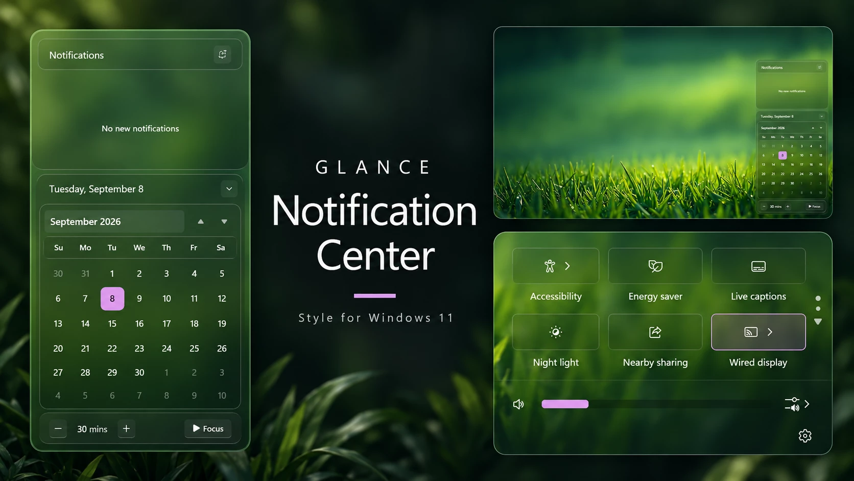
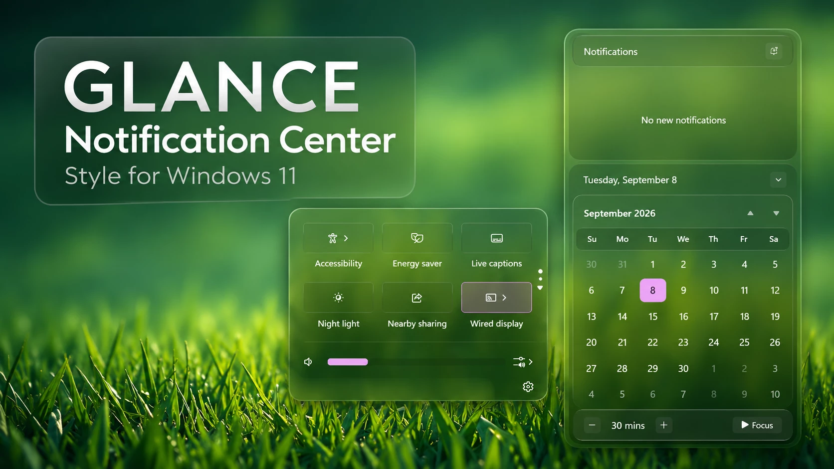
Glance Notification Center Style For Windows 11 brings transparent glass styling to the notification panel, calendar and Quick Settings using Windhawk. Rounded corners, subtle outlines and softly shaded backgrounds give these areas a clean, coordinated appearance.
White text keeps the design simple, while purple accents add contrast to the calendar and volume slider. Your wallpaper remains visible through the panels, helping the customization blend naturally with the rest of your desktop.
Transparent Glass Notification Panel
The notification area sits above the calendar in its own rounded card. A gently shaded header separates the Notifications title from the content area, while a fine border gives the panel definition against the wallpaper.
The design leaves comfortable space around the heading and notification area. Its translucent background keeps the panel visually light, making it a good fit for a desktop built around glass effects and minimal decoration.
A Clean Calendar with Purple Accents
The calendar uses a rounded outer container with a neatly framed monthly grid. The date heading sits at the top, followed by the month title and navigation controls. A separate strip behind the weekday labels helps organize the layout.
A purple date highlight adds contrast among the white calendar numbers. Muted dates from the surrounding months keep the current month’s grid easy to distinguish.
Focus controls sit in a compact section beneath the calendar. The duration display, minus and plus buttons, and Focus button share the same translucent styling, giving the lower section a consistent appearance.
Matching Quick Settings Design
Glance also carries its glass styling into Quick Settings. Buttons use a three-column arrangement, with outlined backgrounds, simple white icons and labels underneath.
Controls such as Accessibility, Energy saver, Live captions, Night light, Nearby sharing and Wired display fit into this layout. The available controls depend on your device and Windows version.
A purple volume slider adds a small accent below the buttons. Audio controls and the Settings shortcut complete the lower section, while the transparent background connects the panel visually with the notification center and calendar.
Choosing a Wallpaper for the Glass Effect
Wallpaper choice makes a noticeable difference because the background remains visible through the panels. Green nature wallpapers pair well with the purple accents, while darker backgrounds can give the white text stronger contrast.
Choose a wallpaper with a calm or softly shaded area behind the panels. Very bright highlights and busy patterns can make small labels harder to read. Open the calendar and Quick Settings while choosing your wallpaper so you can check the balance for yourself.
- Transparent Glass Backgrounds
- Rounded Corners and Subtle Borders
- Separate Notification and Calendar Panels
- Purple Calendar Date Highlight
- Focus Controls Below the Calendar
- Matching Glass Quick Settings
- Purple Volume Slider Accent
- Clean and Minimal Layout
- Windows 11 21H2: Yes
- Windows 11 22H2: Yes
- Windows 11 23H2: Yes
- Windows 11 24H2: Yes
- Windows 11 25H2: Yes
- Download and install Windhawk.
- Open Windhawk and install the Windows 11 Notification Center Styler mod.
- Open the mod and go to the Advanced tab.
- Copy the complete JSON configuration code provided in this post and paste it into the Mod settings box, replacing the existing code.
- Click Save to apply the style.
- Close and reopen Notification Center by clicking the taskbar date and time or pressing Win + N to view the changes.
- For more details, visit the Windows 11 Notification Center Styling Guide.
{ "theme": "Glance Glass By Link Vegas", "styleConstants[0]": "transparent=<SolidColorBrush Color=\"Transparent\"/>", "styleConstants[1]": "base=<WindhawkBlur BlurAmount=\"5\" TintColor=\"#1A000000\" />", "styleConstants[2]": "overlay=<WindhawkBlur BlurAmount=\"5\" TintColor=\"#0D000000\" />", "styleConstants[3]": "accentColor=<SolidColorBrush Color=\"{ThemeResource SystemAccentColorLight1}\" Opacity = \"1\" />", "styleConstants[4]": "overlay2=<WindhawkBlur BlurAmount=\"5\" TintColor=\"#0D000000\" />", "styleConstants[5]": "r1=18", "styleConstants[6]": "r2=14", "styleConstants[7]": "r3=12", "styleConstants[8]": "thumbnailImageSize=300", "styleConstants[9]": "glassBorder=<LinearGradientBrush StartPoint=\"0,0\" EndPoint=\"0,1\"><GradientStop Color=\"#50808080\" Offset=\"0.0\" /><GradientStop Color=\"#50404040\" Offset=\"0.25\" /><GradientStop Color=\"#50808080\" Offset=\"1\" /></LinearGradientBrush>", "styleConstants[10]": "innerBorder=<LinearGradientBrush StartPoint=\"0,0\" EndPoint=\"0,1\"><GradientStop Color=\"#40B5B5B5\" Offset=\"0.0\" /><GradientStop Color=\"#40B5B5B5\" Offset=\"0.3\" /><GradientStop Color=\"#20050505\" Offset=\"0.45\" /><GradientStop Color=\"#40040404\" Offset=\"0.75\" /><GradientStop Color=\"#20050505\" Offset=\"0.85\" /><GradientStop Color=\"#40ACACAC\" Offset=\"1\" /></LinearGradientBrush>", "styleConstants[11]": "hover=<WindhawkBlur BlurAmount=\"5\" TintColor=\"{ThemeResource SystemChromeMediumColor}\" TintOpacity=\"0.1\" />", "styleConstants[12]": "pressed=<WindhawkBlur BlurAmount=\"5\" TintColor=\"{ThemeResource SystemChromeMediumColor}\" TintOpacity=\"0.1\" />", "styleConstants[13]": "hoverBorder=<LinearGradientBrush StartPoint=\"0,0\" EndPoint=\"0,1\"><GradientStop Offset=\"0\" Color=\"#2FFFFFFF\" /><GradientStop Offset=\"0.2\" Color=\"#1AFFFFFF\" /><GradientStop Offset=\"0.65\" Color=\"#1AF0F0F0\" /><GradientStop Offset=\"1\" Color=\"#2F707070\" /></LinearGradientBrush>", "styleConstants[14]": "tray=<WindhawkBlur BlurAmount=\"14\" TintColor=\"#3E4A4A4A\"/>", "styleConstants[15]": "trayBorder=<LinearGradientBrush StartPoint=\"0,0\" EndPoint=\"0,1\"><GradientStop Color=\"#70D3D3D3\" Offset=\"0.0\" /><GradientStop Color=\"#50404040\" Offset=\"0.1\" /><GradientStop Color=\"#69404040\" Offset=\"0.25\" /><GradientStop Color=\"#60292929\" Offset=\"0.5\" /><GradientStop Color=\"#69404040\" Offset=\"0.75\" /><GradientStop Color=\"#50404040\" Offset=\"0.9\" /><GradientStop Color=\"#70C1C1C1\" Offset=\"1\" /></LinearGradientBrush>", "styleConstants[16]": "header=<WindhawkBlur BlurAmount=\"18\" TintColor=\"#10151515\"/>", "styleConstants[17]": "headerBorder=<LinearGradientBrush StartPoint=\"0,0\" EndPoint=\"0,1\"><GradientStop Color=\"#70C1C1C1\" Offset=\"0.0\" /><GradientStop Color=\"#50404040\" Offset=\"0.1\" /><GradientStop Color=\"#59393939\" Offset=\"0.25\" /><GradientStop Color=\"#50202020\" Offset=\"0.5\" /><GradientStop Color=\"#59393939\" Offset=\"0.75\" /><GradientStop Color=\"#50404040\" Offset=\"0.9\" /><GradientStop Color=\"#70C1C1C1\" Offset=\"1\" /></LinearGradientBrush>", "styleConstants[18]": "flyoutBorder=<LinearGradientBrush StartPoint=\"0,0\" EndPoint=\"0,1\"><GradientStop Color=\"#70D3D3D3\" Offset=\"0.0\" /><GradientStop Color=\"#60CDCDCD\" Offset=\"0.25\" /><GradientStop Color=\"#40CDCDCD\" Offset=\"0.4\" /><GradientStop Color=\"#40696969\" Offset=\"0.65\" /><GradientStop Color=\"#553C3C3C\" Offset=\"1\" /></LinearGradientBrush>", "styleConstants[19]": "glassBorderThickness=0.3,1,0.3,1", "styleConstants[20]": "innerBorderThickness=1", "styleConstants[21]": "buttonGlass=<WindhawkBlur BlurAmount=\"5\" TintColor=\"#0D000000\" />", "styleConstants[22]": "buttonHoverGlass=<WindhawkBlur BlurAmount=\"5\" TintColor=\"{ThemeResource SystemChromeMediumColor}\" TintOpacity=\"0.1\" />", "styleConstants[23]": "buttonPressedGlass=<WindhawkBlur BlurAmount=\"5\" TintColor=\"#1A000000\" />", "styleConstants[24]": "buttonDisabledGlass=<WindhawkBlur BlurAmount=\"5\" TintColor=\"#08000000\" />", "styleConstants[25]": "buttonCheckedGlass=<WindhawkBlur BlurAmount=\"5\" TintColor=\"{ThemeResource SystemAccentColorLight1}\" TintOpacity=\"0.22\" />", "styleConstants[26]": "buttonCheckedHoverGlass=<WindhawkBlur BlurAmount=\"5\" TintColor=\"{ThemeResource SystemAccentColorLight1}\" TintOpacity=\"0.30\" />", "styleConstants[27]": "buttonCheckedPressedGlass=<WindhawkBlur BlurAmount=\"5\" TintColor=\"{ThemeResource SystemAccentColorLight1}\" TintOpacity=\"0.14\" />", "styleConstants[28]": "buttonCheckedDisabledGlass=<WindhawkBlur BlurAmount=\"5\" TintColor=\"{ThemeResource SystemAccentColorLight1}\" TintOpacity=\"0.08\" />", "styleConstants[29]": "buttonCheckedBorder=<LinearGradientBrush StartPoint=\"0,0\" EndPoint=\"0,1\" Opacity=\"0.75\"><GradientStop Color=\"{ThemeResource SystemAccentColorLight1}\" Offset=\"0\" /><GradientStop Color=\"#35FFFFFF\" Offset=\"0.5\" /><GradientStop Color=\"{ThemeResource SystemAccentColorLight1}\" Offset=\"1\" /></LinearGradientBrush>", "styleConstants[30]": "buttonDisabledBorder=<SolidColorBrush Color=\"#25FFFFFF\" />", "controlStyles[0].target": "Grid#NotificationCenterGrid", "controlStyles[0].styles[0]": "Background:=$base", "controlStyles[0].styles[1]": "BorderThickness=$glassBorderThickness", "controlStyles[0].styles[2]": "CornerRadius=$r1", "controlStyles[0].styles[3]": "Shadow:=", "controlStyles[0].styles[4]": "BorderBrush:=$glassBorder", "controlStyles[0].styles[5]": "RequestedTheme=2", "controlStyles[1].target": "Grid#CalendarCenterGrid", "controlStyles[1].styles[0]": "Background:=$base", "controlStyles[1].styles[1]": "BorderThickness=$glassBorderThickness", "controlStyles[1].styles[2]": "CornerRadius=$r1", "controlStyles[1].styles[3]": "Shadow:=", "controlStyles[1].styles[4]": "Margin=0,6,0,6", "controlStyles[1].styles[5]": "MinHeight=40", "controlStyles[1].styles[6]": "BorderBrush:=$glassBorder", "controlStyles[1].styles[7]": "RequestedTheme=2", "controlStyles[2].target": "ScrollViewer#CalendarControlScrollViewer", "controlStyles[2].styles[0]": "Background:=$overlay", "controlStyles[2].styles[1]": "CornerRadius=$r2", "controlStyles[2].styles[2]": "Margin=-10,11,-10,-14", "controlStyles[2].styles[3]": "Shadow:=", "controlStyles[2].styles[4]": "BorderBrush:=$innerBorder", "controlStyles[2].styles[5]": "BorderThickness=$innerBorderThickness", "controlStyles[3].target": "Border#CalendarHeaderMinimizedOverlay", "controlStyles[3].styles[0]": "Background:=$overlay", "controlStyles[3].styles[1]": "CornerRadius=$r2", "controlStyles[3].styles[2]": "Shadow:=", "controlStyles[3].styles[3]": "Margin=-10,-6,-10,-8", "controlStyles[3].styles[4]": "Height=45", "controlStyles[3].styles[5]": "BorderBrush:=$innerBorder", "controlStyles[3].styles[6]": "BorderThickness=$innerBorderThickness", "controlStyles[4].target": "ActionCenter.FocusSessionControl#FocusSessionControl > Grid#FocusGrid", "controlStyles[4].styles[0]": "Background:=$tray", "controlStyles[4].styles[1]": "CornerRadius=$r2", "controlStyles[4].styles[2]": "Margin=6,7,6,6", "controlStyles[4].styles[3]": "Shadow:=", "controlStyles[4].styles[4]": "BorderBrush:=$trayBorder", "controlStyles[4].styles[5]": "BorderThickness=$innerBorderThickness", "controlStyles[5].target": "MenuFlyoutPresenter", "controlStyles[5].styles[0]": "Background:=$base", "controlStyles[5].styles[1]": "BorderThickness=$glassBorderThickness", "controlStyles[5].styles[2]": "CornerRadius=$r3", "controlStyles[5].styles[3]": "Padding=1,2,1,2", "controlStyles[5].styles[4]": "Shadow:=", "controlStyles[5].styles[5]": "BorderBrush:=$flyoutBorder", "controlStyles[5].styles[6]": "RequestedTheme=2", "controlStyles[6].target": "Border#JumpListRestyledAcrylic", "controlStyles[6].styles[0]": "Background:=$base", "controlStyles[6].styles[1]": "BorderThickness=$glassBorderThickness", "controlStyles[6].styles[2]": "CornerRadius=$r3", "controlStyles[6].styles[3]": "Margin=-2,-2,-2,-2", "controlStyles[6].styles[4]": "Shadow:=", "controlStyles[6].styles[5]": "BorderBrush:=$glassBorder", "controlStyles[6].styles[6]": "RequestedTheme=2", "controlStyles[7].target": "Grid#ControlCenterRegion", "controlStyles[7].styles[0]": "Background:=$base", "controlStyles[7].styles[1]": "CornerRadius=$r1", "controlStyles[7].styles[2]": "BorderThickness=$glassBorderThickness", "controlStyles[7].styles[3]": "Shadow:=", "controlStyles[7].styles[4]": "Margin=0,0,0,-6", "controlStyles[7].styles[5]": "BorderBrush:=$glassBorder", "controlStyles[7].styles[6]": "RequestedTheme=2", "controlStyles[8].target": "ContentPresenter#PageContent", "controlStyles[8].styles[0]": "Background:=$transparent", "controlStyles[8].styles[1]": "Shadow:=", "controlStyles[9].target": "ContentPresenter#PageContent > Grid > Border", "controlStyles[9].styles[0]": "Background:=$overlay", "controlStyles[9].styles[1]": "CornerRadius=$r2", "controlStyles[9].styles[2]": "Margin=8,0,8,2", "controlStyles[9].styles[3]": "Shadow:=", "controlStyles[9].styles[4]": "BorderBrush:=$innerBorder", "controlStyles[9].styles[5]": "BorderThickness=$innerBorderThickness", "controlStyles[10].target": "QuickActions.ControlCenter.AccessibleWindow#PageWindow > ContentPresenter > Grid#FullScreenPageRoot", "controlStyles[10].styles[0]": "Background:=$transparent", "controlStyles[10].styles[1]": "Shadow:=", "controlStyles[10].styles[2]": "RequestedTheme=2", "controlStyles[11].target": "QuickActions.ControlCenter.AccessibleWindow#PageWindow > ContentPresenter > Grid#FullScreenPageRoot > ContentPresenter#PageHeader", "controlStyles[11].styles[0]": "Background:=$overlay", "controlStyles[11].styles[1]": "CornerRadius=$r2", "controlStyles[11].styles[2]": "Margin=7,7,7,7", "controlStyles[11].styles[3]": "Shadow:=", "controlStyles[11].styles[4]": "BorderBrush:=$innerBorder", "controlStyles[11].styles[5]": "BorderThickness=$innerBorderThickness", "controlStyles[12].target": "ScrollViewer#ListContent", "controlStyles[12].styles[0]": "Background:=$overlay", "controlStyles[12].styles[1]": "CornerRadius=$r2", "controlStyles[12].styles[2]": "Margin=8,0,8,0", "controlStyles[12].styles[3]": "Shadow:=", "controlStyles[12].styles[4]": "BorderBrush:=$innerBorder", "controlStyles[12].styles[5]": "BorderThickness=$innerBorderThickness", "controlStyles[13].target": "ActionCenter.FlexibleToastView#FlexibleNormalToastView", "controlStyles[13].styles[0]": "Background:=$transparent", "controlStyles[13].styles[1]": "Shadow:=", "controlStyles[13].styles[2]": "RequestedTheme=2", "controlStyles[14].target": "Border#ToastBackgroundBorder2", "controlStyles[14].styles[0]": "Background:=$base", "controlStyles[14].styles[1]": "BorderThickness=$glassBorderThickness", "controlStyles[14].styles[2]": "CornerRadius=16", "controlStyles[14].styles[3]": "Shadow:=", "controlStyles[14].styles[4]": "BorderBrush:=$glassBorder", "controlStyles[15].target": "Border#ToastBackgroundBorder", "controlStyles[15].styles[0]": "Background:=$base", "controlStyles[15].styles[1]": "BorderThickness=$glassBorderThickness", "controlStyles[15].styles[2]": "CornerRadius=16", "controlStyles[15].styles[3]": "Shadow:=", "controlStyles[15].styles[4]": "BorderBrush:=$glassBorder", "controlStyles[16].target": "JumpViewUI.SystemItemListViewItem > Grid#LayoutRoot > Border#BackgroundBorder", "controlStyles[16].styles[0]": "Background:=$overlay", "controlStyles[16].styles[1]": "CornerRadius=8", "controlStyles[16].styles[2]": "BorderBrush:=$innerBorder", "controlStyles[16].styles[3]": "BorderThickness=$innerBorderThickness", "controlStyles[17].target": "JumpViewUI.JumpListListViewItem > Grid#LayoutRoot > Border#BackgroundBorder", "controlStyles[17].styles[0]": "CornerRadius=6", "controlStyles[18].target": "ActionCenter.FlexibleItemView", "controlStyles[18].styles[0]": "CornerRadius=16", "controlStyles[18].styles[1]": "Shadow:=", "controlStyles[19].target": "QuickActions.AccessibleToggleButton#ToggleButton", "controlStyles[19].styles[0]": "CornerRadius=13", "controlStyles[19].styles[1]": "BorderThickness=0", "controlStyles[20].target": "QuickActions.AccessibleToggleButton#SplitL2Button", "controlStyles[20].styles[0]": "CornerRadius=13", "controlStyles[20].styles[1]": "Margin=4,0,-4,0", "controlStyles[20].styles[2]": "BorderThickness=0", "controlStyles[21].target": "Grid#NotificationCenterTopBanner", "controlStyles[21].styles[0]": "Background:=$header", "controlStyles[21].styles[1]": "CornerRadius=$r2", "controlStyles[21].styles[2]": "Margin=6", "controlStyles[21].styles[3]": "BorderBrush:=$headerBorder", "controlStyles[21].styles[4]": "BorderThickness=$innerBorderThickness", "controlStyles[22].target": "Windows.UI.Xaml.Controls.Grid#L1Grid > Border", "controlStyles[22].styles[0]": "Background:=$transparent", "controlStyles[23].target": "Windows.UI.Xaml.Controls.ContentPresenter", "controlStyles[23].styles[0]": "BorderThickness=0", "controlStyles[24].target": "Windows.UI.Xaml.Controls.Button#FooterButton[AutomationProperties.Name = Edit quick settings]", "controlStyles[24].styles[0]": "Margin=0,0,8,0", "controlStyles[24].styles[1]": "CornerRadius=$r3", "controlStyles[25].target": "Windows.UI.Xaml.Controls.Button[AutomationProperties.AutomationId = Microsoft.QuickAction.Battery]", "controlStyles[25].styles[0]": "Margin=2,0,0,0", "controlStyles[25].styles[1]": "CornerRadius=$r3", "controlStyles[26].target": "Windows.UI.Xaml.Controls.Button#FooterButton[AutomationProperties.Name = All settings]", "controlStyles[26].styles[0]": "Margin=0,0,-1,0", "controlStyles[26].styles[1]": "CornerRadius=13", "controlStyles[27].target": "Windows.UI.Xaml.Controls.Button[AutomationProperties.AutomationId = Microsoft.QuickAction.Volume]", "controlStyles[27].styles[0]": "CornerRadius=10", "controlStyles[28].target": "Windows.UI.Xaml.Controls.Button#VolumeL2Button[AutomationProperties.Name = Select a sound output]", "controlStyles[28].styles[0]": "CornerRadius=10", "controlStyles[29].target": "Windows.UI.Xaml.Shapes.Rectangle#HorizontalTrackRect", "controlStyles[29].styles[0]": "Height=10", "controlStyles[29].styles[1]": "Fill:=$overlay", "controlStyles[29].styles[2]": "RadiusY=3", "controlStyles[29].styles[3]": "RadiusX=3", "controlStyles[30].target": "Windows.UI.Xaml.Shapes.Rectangle#HorizontalDecreaseRect", "controlStyles[30].styles[0]": "Height=10", "controlStyles[30].styles[1]": "RadiusY=3", "controlStyles[30].styles[2]": "RadiusX=3", "controlStyles[30].styles[3]": "Margin=0", "controlStyles[31].target": "Windows.UI.Xaml.Controls.Primitives.Thumb#HorizontalThumb", "controlStyles[31].styles[0]": "Visibility=1", "controlStyles[32].target": "Windows.UI.Xaml.Controls.Grid#MediaTransportControlsRegion", "controlStyles[32].styles[0]": "Height=Auto", "controlStyles[32].styles[1]": "CornerRadius=$r1", "controlStyles[32].styles[2]": "BorderThickness=$glassBorderThickness", "controlStyles[32].styles[3]": "Background:=$base", "controlStyles[32].styles[4]": "Shadow:=", "controlStyles[32].styles[5]": "Padding=0,0,0,12", "controlStyles[32].styles[6]": "Margin=0,0,0,12", "controlStyles[32].styles[7]": "BorderBrush:=$glassBorder", "controlStyles[32].styles[8]": "RequestedTheme=2", "controlStyles[33].target": "Windows.UI.Xaml.Controls.Grid#ThumbnailImage", "controlStyles[33].styles[0]": "Width=$thumbnailImageSize", "controlStyles[33].styles[1]": "Height=$thumbnailImageSize", "controlStyles[33].styles[2]": "HorizontalAlignment=Center", "controlStyles[33].styles[3]": "VerticalAlignment=Top", "controlStyles[33].styles[4]": "Grid.Column=1", "controlStyles[33].styles[5]": "Margin=0,2,0,45", "controlStyles[33].styles[6]": "CornerRadius=$r2", "controlStyles[34].target": "Windows.UI.Xaml.Controls.StackPanel#PrimaryAndSecondaryTextContainer", "controlStyles[34].styles[0]": "VerticalAlignment=Bottom", "controlStyles[34].styles[1]": "Margin=0,5,0,-5", "controlStyles[35].target": "Windows.UI.Xaml.Controls.StackPanel#PrimaryAndSecondaryTextContainer > Windows.UI.Xaml.Controls.TextBlock#Title", "controlStyles[35].styles[0]": "TextAlignment=Center", "controlStyles[35].styles[1]": "FontFamily=Tektur", "controlStyles[35].styles[2]": "FontSize=18", "controlStyles[36].target": "Windows.UI.Xaml.Controls.StackPanel#PrimaryAndSecondaryTextContainer > Windows.UI.Xaml.Controls.TextBlock#Subtitle", "controlStyles[36].styles[0]": "TextAlignment=Center", "controlStyles[36].styles[1]": "FontFamily=Montserrat", "controlStyles[36].styles[2]": "Margin=0,3,0,0", "controlStyles[36].styles[3]": "FontWeight=600", "controlStyles[37].target": "Windows.UI.Xaml.Controls.ListView#MediaButtonsListView", "controlStyles[37].styles[0]": "VerticalAlignment=Top", "controlStyles[37].styles[1]": "Height=48", "controlStyles[37].styles[2]": "Margin=0,12,0,-12", "controlStyles[38].target": "Windows.UI.Xaml.Controls.Primitives.RepeatButton#PreviousButton > Windows.UI.Xaml.Controls.ContentPresenter#ContentPresenter@CommonStates", "controlStyles[38].styles[0]": "Background@Normal:=$overlay", "controlStyles[38].styles[1]": "Background@PointerOver:=$hover", "controlStyles[38].styles[2]": "Background@Pressed:=$pressed", "controlStyles[38].styles[3]": "Width=40", "controlStyles[38].styles[4]": "Height=30", "controlStyles[38].styles[5]": "CornerRadius=6", "controlStyles[38].styles[6]": "Margin=15,0,0,0", "controlStyles[38].styles[7]": "BorderBrush@Normal:=$innerBorder", "controlStyles[38].styles[8]": "BorderBrush@PointerOver:=$hoverBorder", "controlStyles[38].styles[9]": "BorderBrush@Pressed:=$hoverBorder", "controlStyles[38].styles[10]": "BorderThickness=$innerBorderThickness", "controlStyles[39].target": "Windows.UI.Xaml.Controls.Button#PlayPauseButton > Windows.UI.Xaml.Controls.ContentPresenter#ContentPresenter@CommonStates", "controlStyles[39].styles[0]": "Background@Normal:=$overlay", "controlStyles[39].styles[1]": "Background@PointerOver:=$hover", "controlStyles[39].styles[2]": "Background@Pressed:=$pressed", "controlStyles[39].styles[3]": "Width=40", "controlStyles[39].styles[4]": "Height=40", "controlStyles[39].styles[5]": "CornerRadius=8", "controlStyles[39].styles[6]": "Margin=-10,0,0,0", "controlStyles[39].styles[7]": "BorderBrush@Normal:=$innerBorder", "controlStyles[39].styles[8]": "BorderBrush@PointerOver:=$hoverBorder", "controlStyles[39].styles[9]": "BorderBrush@Pressed:=$hoverBorder", "controlStyles[39].styles[10]": "BorderThickness=$innerBorderThickness", "controlStyles[40].target": "Windows.UI.Xaml.Controls.Primitives.RepeatButton#NextButton > Windows.UI.Xaml.Controls.ContentPresenter#ContentPresenter@CommonStates", "controlStyles[40].styles[0]": "Background@Normal:=$overlay", "controlStyles[40].styles[1]": "Background@PointerOver:=$hover", "controlStyles[40].styles[2]": "Background@Pressed:=$pressed", "controlStyles[40].styles[3]": "Width=40", "controlStyles[40].styles[4]": "Height=30", "controlStyles[40].styles[5]": "CornerRadius=6", "controlStyles[40].styles[6]": "Margin=-20,0,0,0", "controlStyles[40].styles[7]": "BorderBrush@Normal:=$innerBorder", "controlStyles[40].styles[8]": "BorderBrush@PointerOver:=$hoverBorder", "controlStyles[40].styles[9]": "BorderBrush@Pressed:=$hoverBorder", "controlStyles[40].styles[10]": "BorderThickness=$innerBorderThickness", "controlStyles[41].target": "Windows.UI.Xaml.Controls.TextBlock#AppNameText", "controlStyles[41].styles[0]": "FontFamily=Tektur", "controlStyles[41].styles[1]": "FontSize=16", "controlStyles[42].target": "Windows.UI.Xaml.Controls.Image#IconImage", "controlStyles[42].styles[0]": "Height=20", "controlStyles[42].styles[1]": "Width=20", "controlStyles[43].target": "Grid#MediaTransportControlsRoot", "controlStyles[43].styles[0]": "Background:=$transparent", "controlStyles[44].target": "Grid#ToastPeekRegion", "controlStyles[44].styles[0]": "Background=Transparent", "controlStyles[44].styles[1]": "RenderTransform:=<TranslateTransform Y=\"-495\" X=\"395\" />", "controlStyles[44].styles[2]": "Grid.Column=0", "controlStyles[44].styles[3]": "Grid.Row=2", "controlStyles[45].target": "Windows.UI.Xaml.Controls.CalendarViewDayItem > Windows.UI.Xaml.Controls.Border", "controlStyles[45].styles[0]": "CornerRadius=8", "controlStyles[45].styles[1]": "Margin=1,2,1,2", "controlStyles[46].target": "Windows.UI.Xaml.Controls.CalendarViewDayItem", "controlStyles[46].styles[0]": "CornerRadius=8", "controlStyles[47].target": "Windows.UI.Xaml.Controls.Control > Windows.UI.Xaml.Controls.Border", "controlStyles[47].styles[0]": "CornerRadius=8", "controlStyles[48].target": "Windows.UI.Xaml.Controls.Primitives.CalendarViewItem", "controlStyles[48].styles[0]": "CornerRadius=8", "controlStyles[49].target": "Windows.UI.Xaml.Controls.ListViewHeaderItem", "controlStyles[49].styles[0]": "Margin=50,6,50,2", "controlStyles[49].styles[1]": "CornerRadius=8", "controlStyles[49].styles[2]": "Height=35", "controlStyles[50].target": "Windows.UI.Xaml.Controls.Button#SettingsButton", "controlStyles[50].styles[0]": "CornerRadius=4", "controlStyles[51].target": "Windows.UI.Xaml.Controls.Button#DismissButton", "controlStyles[51].styles[0]": "CornerRadius=4", "controlStyles[52].target": "Windows.UI.Xaml.Controls.StackPanel#CalendarHeader", "controlStyles[52].styles[0]": "Margin=6,0,0,0", "controlStyles[53].target": "Windows.UI.Xaml.Controls.ScrollContentPresenter#ScrollContentPresenter", "controlStyles[53].styles[0]": "Margin=1,2,1,2", "controlStyles[54].target": "Windows.UI.Xaml.Controls.Grid#WeekDayNames", "controlStyles[54].styles[0]": "Background:=$header", "controlStyles[54].styles[1]": "CornerRadius=8", "controlStyles[54].styles[2]": "Margin=4,0,4,0", "controlStyles[54].styles[3]": "Padding=0,-5,0,-3", "controlStyles[54].styles[4]": "BorderBrush:=$headerBorder", "controlStyles[54].styles[5]": "BorderThickness=$innerBorderThickness", "controlStyles[55].target": "Windows.UI.Xaml.Controls.ListViewItem", "controlStyles[55].styles[0]": "CornerRadius=$r3", "controlStyles[56].target": "Windows.UI.Xaml.Controls.Grid#RootGrid > Windows.UI.Xaml.Controls.ContentPresenter#ContentPresenter", "controlStyles[56].styles[0]": "Background:=$overlay", "controlStyles[56].styles[1]": "BorderThickness=$innerBorderThickness", "controlStyles[56].styles[2]": "CornerRadius=8", "controlStyles[56].styles[3]": "BorderBrush:=$innerBorder", "controlStyles[57].target": "Windows.UI.Xaml.Controls.Grid > Windows.UI.Xaml.Controls.Border#ItemOpaquePlating", "controlStyles[57].styles[0]": "Background:=$overlay2", "controlStyles[57].styles[1]": "BorderThickness=0", "controlStyles[57].styles[2]": "CornerRadius=$r3", "controlStyles[58].target": "Windows.UI.Xaml.Controls.Grid#StandardHeroContainer", "controlStyles[58].styles[0]": "Margin=12,0,12,0", "controlStyles[58].styles[1]": "CornerRadius=0", "controlStyles[58].styles[2]": "Height=150", "controlStyles[59].target": "Windows.UI.Xaml.Controls.Primitives.ScrollBar#VerticalScrollBar", "controlStyles[59].styles[0]": "Visibility=1", "controlStyles[60].target": "Windows.UI.Xaml.Controls.Grid#SliderContainer", "controlStyles[60].styles[0]": "Margin=0,-2,0,0", "controlStyles[61].target": "Windows.UI.Xaml.Controls.Button#BackButton", "controlStyles[61].styles[0]": "CornerRadius=$r3", "controlStyles[62].target": "Windows.UI.Xaml.Shapes.Rectangle#OuterBorder", "controlStyles[62].styles[0]": "RadiusX=6", "controlStyles[62].styles[1]": "RadiusY=6", "controlStyles[62].styles[2]": "Height=18", "controlStyles[63].target": "Windows.UI.Xaml.Shapes.Rectangle#SwitchKnobOff", "controlStyles[63].styles[0]": "RadiusY=3", "controlStyles[63].styles[1]": "RadiusX=3", "controlStyles[64].target": "Windows.UI.Xaml.Controls.Border#SwitchKnobOn", "controlStyles[64].styles[0]": "CornerRadius=3", "controlStyles[65].target": "Windows.UI.Xaml.Shapes.Rectangle#SwitchKnobBounds", "controlStyles[65].styles[0]": "RadiusX=6", "controlStyles[65].styles[1]": "RadiusY=6", "controlStyles[65].styles[2]": "Height=18", "controlStyles[66].target": "ActionCenter.NotificationListViewItem", "controlStyles[66].styles[0]": "Margin=5,2,5,3", "controlStyles[67].target": "Windows.UI.Xaml.Controls.Grid[AutomationProperties.LocalizedLandmarkType = Footer]", "controlStyles[67].styles[0]": "BorderThickness=0", "controlStyles[68].target": "NetworkUX.View.SettingsListViewItem > Windows.UI.Xaml.Controls.Primitives.ListViewItemPresenter#Root", "controlStyles[68].styles[0]": "CornerRadius=12", "controlStyles[69].target": "Windows.UI.Xaml.Controls.ContentPresenter > Windows.UI.Xaml.Controls.Border", "controlStyles[69].styles[0]": "BorderThickness=0", "controlStyles[70].target": "Button#ClearAll", "controlStyles[70].styles[0]": "AccessKey=x", "controlStyles[71].target": "Button#ExpandCollapseButton", "controlStyles[71].styles[0]": "AccessKey=e", "controlStyles[72].target": "ControlCenter.PaginatedToggleButton > Windows.UI.Xaml.Controls.ContentPresenter@CommonStates", "controlStyles[72].styles[0]": "BorderThickness=1", "controlStyles[72].styles[1]": "Background@Normal:=$buttonGlass", "controlStyles[72].styles[2]": "BorderBrush@Normal:=$innerBorder", "controlStyles[72].styles[3]": "Foreground@Normal=#F2FFFFFF", "controlStyles[72].styles[4]": "Background@PointerOver:=$buttonHoverGlass", "controlStyles[72].styles[5]": "BorderBrush@PointerOver:=$hoverBorder", "controlStyles[72].styles[6]": "Foreground@PointerOver=#FFFFFFFF", "controlStyles[72].styles[7]": "Background@Pressed:=$buttonPressedGlass", "controlStyles[72].styles[8]": "BorderBrush@Pressed:=$hoverBorder", "controlStyles[72].styles[9]": "Foreground@Pressed=#DDFFFFFF", "controlStyles[72].styles[10]": "Background@Disabled:=$buttonDisabledGlass", "controlStyles[72].styles[11]": "BorderBrush@Disabled:=$buttonDisabledBorder", "controlStyles[72].styles[12]": "Foreground@Disabled=#66FFFFFF", "controlStyles[72].styles[13]": "Background@Checked:=$buttonCheckedGlass", "controlStyles[72].styles[14]": "BorderBrush@Checked:=$buttonCheckedBorder", "controlStyles[72].styles[15]": "Foreground@Checked=#FFFFFFFF", "controlStyles[72].styles[16]": "Background@CheckedPointerOver:=$buttonCheckedHoverGlass", "controlStyles[72].styles[17]": "BorderBrush@CheckedPointerOver:=$buttonCheckedBorder", "controlStyles[72].styles[18]": "Foreground@CheckedPointerOver=#FFFFFFFF", "controlStyles[72].styles[19]": "Background@CheckedPressed:=$buttonCheckedPressedGlass", "controlStyles[72].styles[20]": "BorderBrush@CheckedPressed:=$buttonCheckedBorder", "controlStyles[72].styles[21]": "Foreground@CheckedPressed=#EEFFFFFF", "controlStyles[72].styles[22]": "Background@CheckedDisabled:=$buttonCheckedDisabledGlass", "controlStyles[72].styles[23]": "BorderBrush@CheckedDisabled:=$buttonDisabledBorder", "controlStyles[72].styles[24]": "Foreground@CheckedDisabled=#66FFFFFF", "controlStyles[73].target": "QuickActions.AccessibleToggleButton > Windows.UI.Xaml.Controls.ContentPresenter@CommonStates", "controlStyles[73].styles[0]": "BorderThickness=1", "controlStyles[73].styles[1]": "Background@Normal:=$buttonGlass", "controlStyles[73].styles[2]": "BorderBrush@Normal:=$innerBorder", "controlStyles[73].styles[3]": "Foreground@Normal=#F2FFFFFF", "controlStyles[73].styles[4]": "Background@PointerOver:=$buttonHoverGlass", "controlStyles[73].styles[5]": "BorderBrush@PointerOver:=$hoverBorder", "controlStyles[73].styles[6]": "Foreground@PointerOver=#FFFFFFFF", "controlStyles[73].styles[7]": "Background@Pressed:=$buttonPressedGlass", "controlStyles[73].styles[8]": "BorderBrush@Pressed:=$hoverBorder", "controlStyles[73].styles[9]": "Foreground@Pressed=#DDFFFFFF", "controlStyles[73].styles[10]": "Background@Disabled:=$buttonDisabledGlass", "controlStyles[73].styles[11]": "BorderBrush@Disabled:=$buttonDisabledBorder", "controlStyles[73].styles[12]": "Foreground@Disabled=#66FFFFFF", "controlStyles[73].styles[13]": "Background@Checked:=$buttonCheckedGlass", "controlStyles[73].styles[14]": "BorderBrush@Checked:=$buttonCheckedBorder", "controlStyles[73].styles[15]": "Foreground@Checked=#FFFFFFFF", "controlStyles[73].styles[16]": "Background@CheckedPointerOver:=$buttonCheckedHoverGlass", "controlStyles[73].styles[17]": "BorderBrush@CheckedPointerOver:=$buttonCheckedBorder", "controlStyles[73].styles[18]": "Foreground@CheckedPointerOver=#FFFFFFFF", "controlStyles[73].styles[19]": "Background@CheckedPressed:=$buttonCheckedPressedGlass", "controlStyles[73].styles[20]": "BorderBrush@CheckedPressed:=$buttonCheckedBorder", "controlStyles[73].styles[21]": "Foreground@CheckedPressed=#EEFFFFFF", "controlStyles[73].styles[22]": "Background@CheckedDisabled:=$buttonCheckedDisabledGlass", "controlStyles[73].styles[23]": "BorderBrush@CheckedDisabled:=$buttonDisabledBorder", "controlStyles[73].styles[24]": "Foreground@CheckedDisabled=#66FFFFFF"}- Open Windhawk and find Windows 11 Notification Center Styler in your installed mods.
- Turn off the mod’s toggle to disable the custom style while keeping your configuration for future use.
- Alternatively, click Remove and confirm when prompted to uninstall the mod completely.
- Close and reopen Notification Center by clicking the taskbar date and time or pressing Win + N.
- If the custom style remains visible, restart your PC to complete the change.
Check Out My Other Categories
Complete your Windows 11 desktop setup with Taskbar and Start Menu styles that complement your Notification Center.
- Taskbar Styles – Explore glass effects, floating taskbars, rounded designs, and modern layouts for Windhawk.
- Start Menu Styles – Discover transparent backgrounds, minimal layouts, and glass-inspired Start Menu designs for Windhawk.
Disclaimer
This Notification Center style is an unofficial customization for Windows 11 using Windhawk. It is not affiliated with, sponsored by, or endorsed by Microsoft or the Windhawk development team. All product names and trademarks belong to their respective owners.
Compatibility, appearance, and performance may vary depending on your Windows version, Windhawk version, and other installed mods. Before applying the JSON configuration, back up your existing mod settings and create a Windows restore point. Download Windhawk and its mods from official sources. Use this customization at your own discretion, and disable or remove the mod if you experience issues.
Final Words
Glance is a good fit for a Windows 11 desktop built around transparent panels and minimal details. Its matching notification, calendar and Quick Settings styling gives these areas a consistent appearance. Choose a wallpaper that keeps the text readable, save your current Windhawk settings and create a system restore point before applying the style.
Glance Notification Center Style For Windows 11 brings a transparent glass appearance to the notification panel, calendar and Quick Settings using Windhawk. Rounded corners, subtle borders, white labels and purple accents create a clean, coordinated design while allowing your desktop wallpaper to remain visible through the panels.